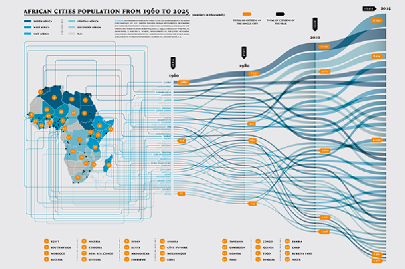
An alluvial diagram is a flow-based chart for showing how groups change across time, stages, or categorical dimensions. It is closely related to the Sankey diagram, but its emphasis is usually on the rearrangement of categories: how groups split, merge, persist, or disappear from one state to another.
The name comes from the visual resemblance to alluvial flows in a river delta. In data visualization, the metaphor is useful because the chart lets readers follow continuous streams of cases, entities, or quantities as they pass through multiple classifications.
Historical Background
Alluvial diagrams are related to the broader family of flow diagrams, including Sankey diagrams from the late nineteenth century. The modern use of the term became prominent through Martin Rosvall and Carl T. Bergstrom’s work on mapping change in large networks. Their 2008 paper used alluvial diagrams to summarize how scientific fields changed over time, including the emergence of neuroscience as a distinct field.
The technique later spread beyond network science. Tools such as ggalluvial for R, RAWGraphs, Flourish, and D3-based implementations made it easier to use alluvial diagrams for social science, biology, education, product analytics, and business reporting.
Data Structure
An alluvial diagram usually consists of axes, strata, and flows.
| Element | Role |
|---|---|
| Axis | An ordered stage, time point, or categorical dimension |
| Stratum | A category shown on an axis |
| Flow | A band connecting categories across adjacent axes |
| Weight | The quantity represented by the height or thickness of a flow |
The data can be represented in a wide format, where each row contains the category assignment for each axis, or in a long format, where each row describes one entity at one stage. In either case, the essential requirement is that each record can be traced across multiple states.
Purpose
The purpose of an alluvial diagram is to make categorical transition visible. It answers questions such as:
- Which groups remain stable?
- Which groups split into smaller groups?
- Which groups merge into a larger group?
- Which transitions account for most of the total volume?
- Where do unusual or unexpected paths appear?
This makes the chart useful when the story is not only about amount, but also about membership and reassignment.
Use Cases
- Party preference changes across election surveys
- Customer segments moving between lifecycle stages
- Students changing majors or academic tracks
- Patients moving between diagnosis or treatment categories
- Cluster assignments changing across model versions
- Scientific fields, topics, or communities evolving over time
How to Read It
Read an alluvial diagram from one axis to the next. Each axis represents a stage or category dimension, and each block on that axis represents a category. The height of a block shows the total quantity assigned to that category.
The bands between axes show how those quantities move. A thick band means many cases follow that path. When one band splits into several bands, a group has been redistributed. When several bands merge into one, different groups have converged. Color is often used to help readers track either the origin category, the destination category, or a highlighted path.
Design Notes
- Keep the number of axes and categories manageable.
- Use consistent color when the same category appears across axes.
- Decide whether color should encode origin, destination, or group identity.
- Minimize unnecessary crossings through careful ordering.
- Label strata clearly and keep labels close to their axis.
- Use interaction or highlighting when there are many flows.
- Avoid implying individual movement if the data only describes aggregate counts.
Strengths
- Shows splits, merges, and persistence in one view.
- Makes categorical change easier to follow than a table.
- Works well for longitudinal or multi-stage classification data.
- Can reveal dominant transition paths and small but important exceptions.
Limitations
Alluvial diagrams can become difficult to read when there are too many categories, too many axes, or many similarly sized flows. They are also not ideal for precise numerical comparison; readers can estimate relative size from band thickness, but exact values usually require labels, tooltips, or a supporting table.
Another common risk is overinterpretation. A smooth band may look like a physical flow, but the chart often represents classification changes rather than literal movement.
Alternatives
| Alternative | When to Use It |
|---|---|
| Sankey diagram | When the main subject is quantity flowing through a system |
| Parallel sets | When comparing relationships among categorical variables |
| Stacked bar chart | When composition by stage is more important than individual paths |
| Streamgraph | When continuous time-series composition is the focus |
| Transition matrix | When exact pairwise counts are more important than visual storytelling |
Summary
Alluvial diagrams are effective when categories change across ordered states and the reader needs to understand how groups split, merge, and persist. They are especially useful for explaining transitions and reclassification, but they require careful ordering, color, and labeling to avoid visual clutter.