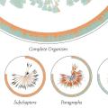
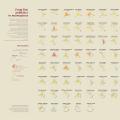
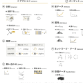
Categories

2026
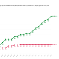
What Is a Bar Chart Race?
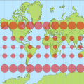
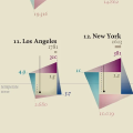
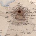
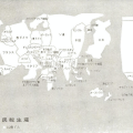
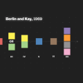
Gridded Cartogram

Pseudo-Continuous Cartogram

Non-Continuous Cartogram

Continuous Cartogram

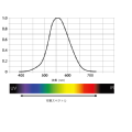
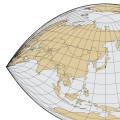
Natural Earth's POV (Point of View) Data
Proportional Flow Map

Graduated Flow Map

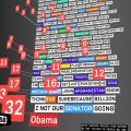
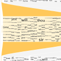
Spark Words

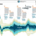
Text Skimming

Typographic Stacked Bar Chart

Typographic Mekko Chart

Typographic Graph

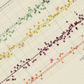
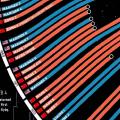
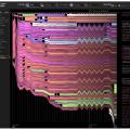
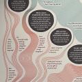
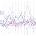
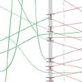
Parallel Coordinates with River Labels

Line Chart with River Labels

Typographic Scatterplots

3D Yield Curve

Heatmap

Mekko Chart

Diverging Bar Chart

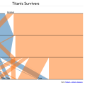
100% Stacked Bar Chart

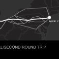
What Is AIS?

What Is ADS-B?

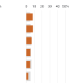
Stacked Bar Chart

Grouped Bar Chart

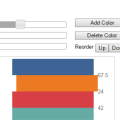
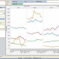
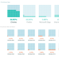
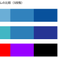
The Evolution of Tableau Color Schemes
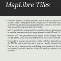
What Is MapLibre Tile (MLT)?
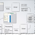
What Is VizQL?
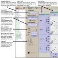
What Is Show Me?
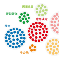
What Is Polaris?
What Is GeoPackage (.gpkg)?

ReConstitution 2008
Quotidian Record
Prime Numerics
Mary Huang's D.dress (2010): UI, Implementation, and Generative Algorithm

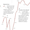
A Typical Day in the Life of Americans
Tokyo Dome City's Adaptive Identity System
The Wind That Moves Us

Participatory Parallel Coordinates Visualized with String

2025
Isopleth Map

Isoline Map

The Structure of the Art World Revealed by Network Science
Comparing the Behavior of Locals and Tourists Through Tweets
Why Web Map Data Sometimes Mentions EPSG:4326 and Sometimes EPSG:3857

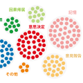
Word Cloud

Word Bubble
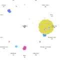
Scatterplot Matrix

How Matplotlib Moved from jet to Viridis
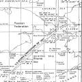
When a Map Projection Changed a Border: The 1990 U.S.-USSR Maritime Boundary Agreement
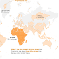
Why the African Union Called for Moving Beyond the Mercator Projection
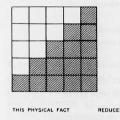
Classified Maps and Choropleth Maps: Data Processing and Map Representation
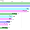
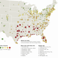
Distances from Major Airports to City Centers
What Is the Craig Projection?
Understanding Map Projection Distortion Through Faces: Projection Face
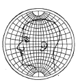
Tissot's Indicatrix
The Map Projection on the United Nations Flag

Rethinking Color Contrast: From WCAG 2.x to APCA

Vector Tile Style Specifications: Comparing Mapbox, MapLibre, and GSI

Understanding Normalization and Standardization with Google Sheets
Using Map Tiles Created in Mapbox Studio with Kepler.gl or Foursquare Studio
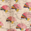
William Playfair's Statistical Representation of the United States of America

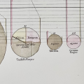
William Playfair Drew Two Different Kinds of Circular Charts
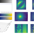
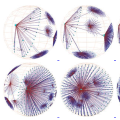
Three-Dimensional Cylindrical Polar Scatter Graph

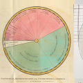
The Invention of the Pie Chart
The Crocodile-Mouth Chart: A Japanese Metaphor for Fiscal Imbalance

Scatter Plot

Range Plot

Pie Chart

Line Chart

How to Choose Among Bar Chart Variants

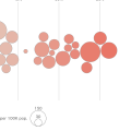
Bubble Chart

Bar Chart

3D Scatterplot

Yield Curve

Waterfall Chart

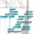
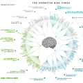
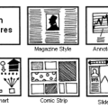
Visualizing the Most Prolific Type Designers
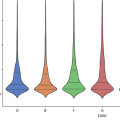
Violin Plot
Vertical Trees and Horizontal Trees

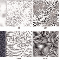
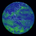
Vector Field Map
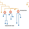
Time-Series Linear Dendrogram
Symbol Chart

Strip Chart
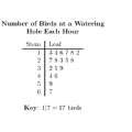
Stem-and-Leaf Plot
Spiral Chart

Space-Time Cube

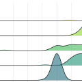
Ridgeline Plot
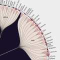
Radial Tree

Radial Bar Chart
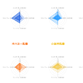
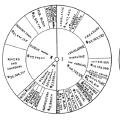
Radar Chart

Isotype Chart

Hyperbolic Tree

Hive Plot
Histogram

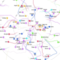
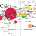
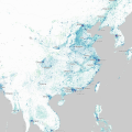
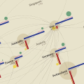
Geography-Based Connection

Gauge Chart

Gapminder World Map 2010
Gantt Chart

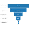
Funnel Chart
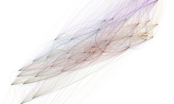
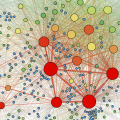
Force-Directed Diagram
Dot Plot

Dot Map
Dot Density Map
Diverging Stacked Bar Chart

Density Plot

Correlogram

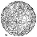
Circular Layout
Circular Chart

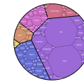
Circle Voronoi Treemaps
Chord Diagram

Candlestick Chart

Calendar Heatmap

Bullet Graph
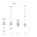
Box-and-Whisker Plot
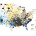
Bivariate Choropleth Map
BioFabric
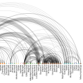
Arc Diagram
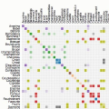
Adjacency Matrix
A Day in the Life of a Colonial Boston Merchant: Visualizing Time and Space

3D Treemaps

3D Choropleth Map

3D Bar Chart Map

Visualizing Brain Drain
From First Publication to Masterpieces: Timelines of Literary Lives
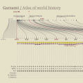
Atlases of World History: How Historical Atlases Distort Historical Memory
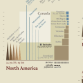
What If the World's Continents Were Drawn on the Same Scale?
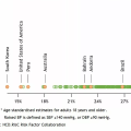
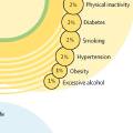
Up to 45% of Dementia Risk May Be Preventable: Visualizing Risk Factors Across the Life Course
Time-Distance Diagram

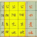
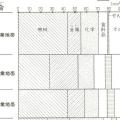
Ninomiya Sontoku and the Idea of Land Classification
Circle Packing

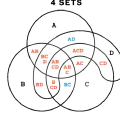
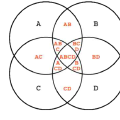
Venn Diagram
Further Education, Longer Life: Visualizing Education and Social Structure
Euler Diagram
Painters in the Making: Lives and Masterpieces
Nobels, No Degrees: Visualizing Genius Beyond Credentials
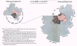
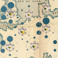
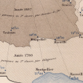
Minard's Map of Napoleon's March to Moscow
Visualizing The Memory of the World Register
Visualizing Progress Toward Gender Equality
Urban Story: Lisbon Is on a Par with Honolulu
Objects Launched into Space
Noise Pollution: Visualizing Urban Noise and Hearing Loss
Waffle Chart
Selling at Sundance: An Infographic on the Economics of Film
Stefanie Posavec's Visualization of On the Road
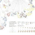
Geniuses, Visualized: Harold Bloom and the Kabbalistic Tree
A New Way to Read Shakespeare
TextArc: A Map for Looking at Alice
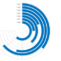
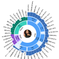
Sunburst Chart
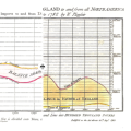
Multicolor and Texture: A 1904 German Wheat-Yield Map
Mission(s) to Mars: Visualizing Challenge and Progress in Mars Exploration
History Flow: Visualizing Wikipedia's Invisible Battles
Digital Nostalgia: Visualizing Internet History in Life Online
(En)tangled Word Bank: Visualizing the Evolution of Darwin's Origin of Species
Polar Area Chart

Connected Scatterplot
Bump Chart
Mosaic Plot
Vaccine Confidence Cascade by Stefanie Posavec
The Origin of the Japanese Term "Quantity-Proportion Graph"
Radar Charts and Parallel Coordinates: A Debate About Readability
Parallel Sets
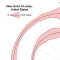
Debates and Alternatives Around the New York Times COVID-19 Spiral Visualization
Beeswarm Plot
Word Spectrum: Visualizing Word Relationships with Google-Scale Data
Visualizing the U.S. Federal Budget: Understanding USA and USAFacts
Newsmap: An Experiment in Seeing the News at a Glance
A South China Morning Post Infographic on Hong Kong's COVID-19 Outbreak

A Big Deal: Visualizing the Economic Scale of RCEP
A Dynamic Identity Reflecting Northern Norway: Visit Nordkyn
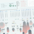
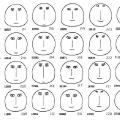
Reading Los Angeles Through Faces: Eugene Turner's Life in Los Angeles
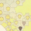
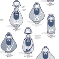
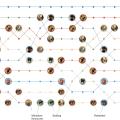
Implementing Chernoff Faces in Data Analysis Languages
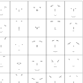
Design-Oriented Chernoff Faces
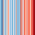
#ShowYourStripes: A Global Campaign that Speaks Climate Change Through Color
The 2011 MIT Media Lab Logo: Algorithmic Design Through Intersections
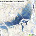
Provisional Inundation Depth Maps from the Geospatial Information Authority of Japan
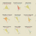
Chernoff Faces
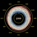
The Temperature Spiral and the Trajectory of Global Warming
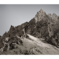
Stock Prices Carved into Mountain Photography: Michael Najjar's High Altitude
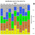
Color Design in Kikikuru Disaster Risk Information
Algorithms That Reshape Terrain: From Kevin Slavin's TED Talk
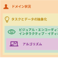
Organizing Cognitive Biases by Task
Looking at Human Thought Through the Cognitive Bias Codex
Comparing Classifications of Cognitive Biases
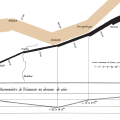
A Statistical Chart Map of Transportation Infrastructure
A Railway Development Map Drawn with Circle Areas
Travel-Cost Distance Cartogram
Time-Distance Cartogram
Classification of Cartograms
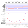
Cartogram

How the Japanese Word for Statistics Became Established

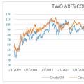
Why Dual-Axis Charts Are Often Criticized, and When They Are Needed


2020
Examples of Focus+Context Techniques
Organizing Interaction in Visual Analytics

A Taxonomy of Interaction Techniques in Information Visualization

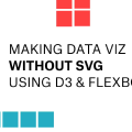
Drawing Charts with D3.js and Flexbox Instead of SVG
Data Visualization as a Medium for Communication

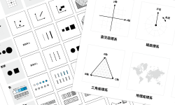
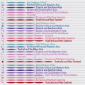
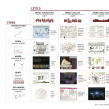
Visual Vocabulary
Scatterplot Matrix
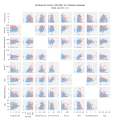
Chart Catalogues by Task
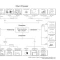
Chart Catalogues by Data Type
Treemap
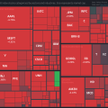
Examples of Treemaps

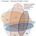
Why Venn Diagrams Fail for Three or More COVID-19 Symptoms
Florence Nightingale's Coxcomb Chart
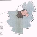
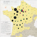
A Cartogram Map as Edwin Reischauer's View Toward Japan
Examples of Vector Field Maps
Examples of Sunburst Charts
Examples of Dasymetric Maps
Dasymetric Map

Icicle Chart
Examples of Icicle Charts

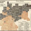
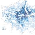
Examples of Choropleth Maps
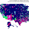
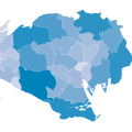
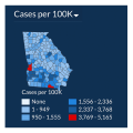
Choropleth Map

Statistical Symbol Map

Proportional Symbol Map
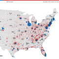
Graduated Symbol Map
Examples of Statistical Symbol Maps
Examples of Dot Maps

Examples of Dot Density Maps

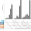
Examples of Beeswarm Plots
Word Clouds and Word Bubbles

Slopegraph
Examples of Mosaic Plots

Examples of Bump Charts
Examples of Alluvial Diagrams
Euler Diagrams and Venn Diagrams
Alluvial Diagrams

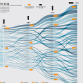
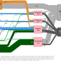
Sankey Diagram
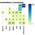
Fineo
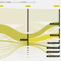
Examples of Sankey Diagrams

Examples of Parallel Sets

The Similar Order in Which Color Names Appear Across Languages
Color Change, Physical Difference, and Psychological Effect
When COVID-19 Broke the Legend
A Critique of Critiques of Data Visualization
The Datasaurus Dozen
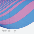
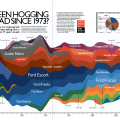
Streamgraph
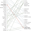
Parallel Coordinates
Examples of Streamgraphs

Examples of Parallel Coordinates

What Are Small Multiples?
Examples of Chart Maps
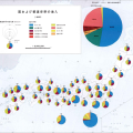
Chart Map

Sketching for Sender-Oriented Information Visualization
Data Humanity for Those Who Remain

Information Visualization Examples from Government Agencies Around the World

The First Mars Image on Television Was a Data Visualization

Data Visualization and Infographic Works that Art Students Noticed in 2020

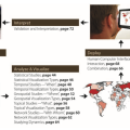
Katy Borner's Need-Driven Workflow Design
When a Person Learns a Word
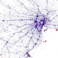
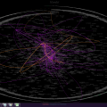
Visualizing Friend Connections on Facebook
Tweets of Support from Around the World After March 11
Apache Superset, the Open Source BI Tool Developed at Airbnb
Uber H3
Different COVID-19 Death Counts for Tokyo in Official Sources
Tamara Munzner's Definition of Tasks: Targets
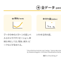
Tamara Munzner's Definition of Tasks: Actions
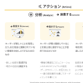
Why Visualize? Actions and Targets in Task Abstraction
What Changes When Moving from Desktop to Mobile Visualization?
What Is GeoJSON?
Data-Ink Ratio
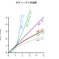
Stevens' Power Law
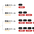
Data Scale
Jenks Natural Breaks in Map Classification

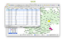
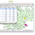
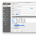
Classification in QGIS
When fTools and GDALTools Are Missing in QGIS

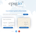
EPSG Codes
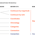
The Seven Cs as an Alternative to LATCH
Four Cascade Levels for Complex Visualization Design Problems
Scientific Visualization and Information Visualization

2019
OpenRefine: GREL Date Function Pattern Characters

Edward Segel's Taxonomy of Data Storytelling
Overthinking This: Handmade Excessive Charts
Four AI Transcription Apps for Attending Overseas Conferences

Six Ways to Find Value in Tweets
JUDGIT!: Searching How National Project Budgets Are Used

Three Different Acts Called Data Visualization
Installing Tabula on Windows When Setup Fails

Data Visualization Creates Value When It Lands with the Audience

A Simple Auto-Reloading Local Server with Visual Studio Code and Live Server