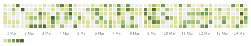
A calendar heatmap visualizes date-based data using the structure of a calendar. Each day is represented by a cell, and color intensity shows the value for that day. It is useful for seeing daily activity, frequency, seasonality, and weekly patterns.

Use Cases
- Contribution or activity logs
- Daily sales or traffic
- Habit tracking
- Weather or environmental daily values
Design Notes
- Make the calendar orientation clear.
- Use a color scale suited to the data.
- Label months and weekdays.
- Consider missing days and holidays.
Summary
Calendar heatmaps are effective when the calendar structure itself matters. They reveal daily and seasonal patterns that ordinary line charts may hide.