A cartogram is a thematic map in which geographic regions are resized, reshaped, or rearranged according to a statistical value such as population, GDP, votes, emissions, or disease burden. Instead of letting land area dominate the visual impression, a cartogram makes the map’s visual area correspond more closely to the phenomenon being discussed.
Cartograms are useful when ordinary maps are misleading because large but sparsely populated regions appear visually dominant, while small but important regions are difficult to see.
Historical Background
Cartograms have a long history in thematic cartography. Early examples appeared in the nineteenth century as mapmakers experimented with anamorphic maps: maps whose shapes were deliberately distorted to represent quantities.
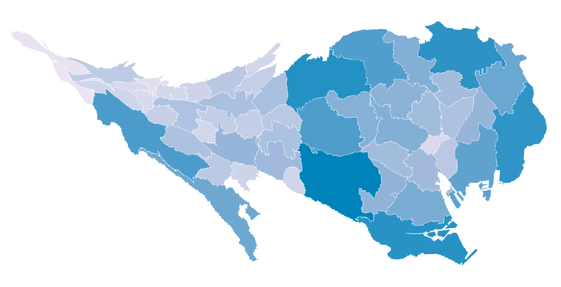
Modern cartograms developed through several computational and design approaches. Continuous cartograms attempt to preserve adjacency while distorting shapes. Non-contiguous cartograms scale regions independently. Dorling cartograms replace regions with circles, and gridded cartograms represent regions as equal cells. Each approach makes a different trade-off between geographic recognizability, area accuracy, and readability.
Data Structure
A cartogram usually combines geographic data with a statistical value.
| Data | Role |
|---|---|
| Region geometry | Country, state, prefecture, or other boundary data |
| Region identifier | Key used to join geometry and statistics |
| Statistical value | Variable that controls size or area |
| Label | Region name or abbreviation |
| Color value | Optional variable used for category or rate |
For continuous and non-contiguous cartograms, polygon geometry is important. For Dorling, pseudo-continuous, and gridded cartograms, regions may be represented by circles, squares, hexagons, or other simplified marks.
Purpose
The purpose of a cartogram is to reduce the visual bias of geographic area. A standard map shows land area faithfully, but many social and economic phenomena are not distributed according to land area. A population cartogram, for example, enlarges densely populated regions and shrinks sparsely populated ones, making the map closer to the geography of people rather than the geography of land.
Use Cases
- Population by country, state, or prefecture
- Election results weighted by voters or seats
- GDP and economic activity
- Public health burden or disease cases
- Carbon emissions and energy consumption
- Education, welfare, and resource inequality
Main Types
| Type | Description |
|---|---|
| Continuous cartogram | Distorts shapes while preserving adjacency |
| Non-contiguous cartogram | Scales regions independently while preserving shape |
| Dorling cartogram | Replaces regions with circles sized by value |
| Gridded cartogram | Gives each region an equal grid cell |
| Pseudo-continuous cartogram | Uses simplified marks while roughly preserving geographic arrangement |
How to Read It
Read the size of each region or mark as the encoded data value. A region that appears large on a cartogram is not necessarily geographically large; it has a large value for the chosen variable.
Because cartograms distort geography, distance, shape, and sometimes adjacency should not be interpreted literally. The title and legend should explain which value controls the transformation. Labels, outlines, and reference maps help readers identify distorted regions.
Design Notes
- State clearly which variable controls area.
- Choose a cartogram type that fits the reading task.
- Use labels because distorted geography can be hard to recognize.
- Consider showing a conventional map as a reference.
- Avoid combining area distortion with an unrelated color scale unless the relationship is meaningful.
- Use animation from a normal map to the cartogram when the transformation itself helps understanding.
- Do not use cartograms when precise distance, shape, or boundary interpretation is required.
Strengths
- Reduces the visual dominance of large land areas.
- Makes population-weighted or value-weighted patterns easier to see.
- Can make inequality and concentration more immediately visible.
- Works well for election, demographic, economic, and public health stories.
Limitations
Cartograms can be difficult for readers who expect familiar geography. Strong distortion may make regions hard to identify, especially small regions or complex coastlines. Different algorithms can also produce different-looking results from the same data, so the design should be explained when the method matters.
Alternatives
| Alternative | When to Use It |
|---|---|
| Choropleth map | Preserves geography and uses color for values or rates |
| Bubble map | Shows quantity with circles on a geographic map |
| Dot-density map | Shows distribution through repeated dots |
| Proportional symbol map | Uses symbols sized by value |
| Ranked bar chart | Compares regions without geographic distortion |
Summary
Cartograms reshape geography so that visual size represents data rather than land area. They are powerful for showing concentration, imbalance, and population-weighted patterns, but they require clear labeling and careful explanation because geographic accuracy is intentionally sacrificed.