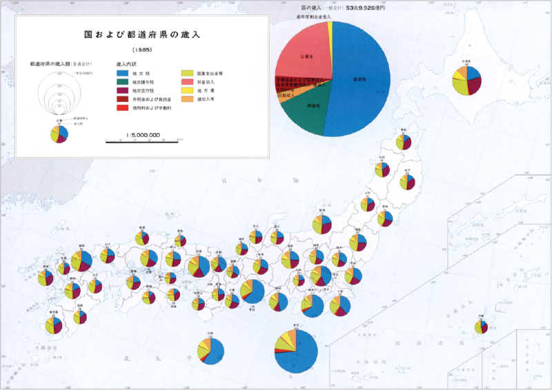
A chart map places statistical charts, such as pie charts, bar charts, or stacked bars, directly on a map. Each chart is attached to a geographic location or region, allowing readers to compare both spatial distribution and statistical composition at the same time.
Compared with a choropleth map, which usually encodes one variable with color, a chart map can show several values or category shares for each place. It can be understood as a form of small multiples constrained by geography.
Historical Background
The idea of placing statistical graphics on maps dates back to nineteenth-century thematic cartography. Charles Joseph Minard created several early examples, including maps that used proportional circles and pie-like symbols to show flows, livestock, trade, and other quantities by place.
In the twentieth century, chart maps became common in census atlases, economic reports, and administrative statistics. With GIS software such as ArcGIS and QGIS, chart symbols became easier to generate. More recently, web mapping tools and libraries such as D3.js, Mapbox GL, and deck.gl have made interactive chart maps possible.
Data Structure
A chart map combines geographic positions with multivariate statistical data.
| Data | Role |
|---|---|
| Geographic unit | Point, region centroid, or administrative area |
| Coordinates or geometry | Determines where the chart is placed |
| Category variables | Parts of a pie, bar, or stacked bar |
| Numeric values | Values encoded by segment length, area, or angle |
| Total value | Optional value used to scale chart size |
When chart size also varies, the total value should be encoded by area rather than diameter to avoid exaggerating large regions.
Purpose
The purpose of a chart map is to compare local composition in geographic context. It answers questions such as:
- Which regions have similar category mixes?
- Where is one category dominant?
- How does the total size differ by region?
- Are neighboring regions statistically similar or different?
Chart maps are most useful when the geographic pattern and the internal breakdown both matter.
Use Cases
- Energy mix by country or region
- Population composition by age group
- Industry structure by city or prefecture
- Election results by district
- Export categories by country
- Public health categories by region
How to Read It
First identify the chart type. A pie chart emphasizes share, a bar chart supports category comparison, and a stacked bar chart combines composition with total amount.
Then check whether chart size has meaning. If all charts are the same size, compare only the internal categories. If chart area is proportional to a total, a larger chart indicates a larger overall value. Finally, use the color legend to identify categories and compare nearby regions for spatial patterns.
Design Notes
- Keep the number of categories small, usually no more than five to seven.
- Avoid placing too many charts on a dense map.
- Use leader lines, offsets, or interaction when charts overlap.
- Make clear whether chart size encodes total value.
- Use a color palette that is readable at small sizes.
- Prefer bar charts over pie charts when precise category comparison matters.
- Provide hover or click details in interactive versions.
Strengths
- Combines geography and multivariate comparison in one view.
- Shows local composition more directly than a choropleth map.
- Can reveal regional clusters of similar profiles.
- Works well for exploratory interactive maps.
Limitations
Chart maps can quickly become cluttered. Small charts are difficult to read, and overlapping symbols can hide important areas. Pie charts on maps are especially hard to compare precisely, so chart maps should be designed for pattern recognition rather than exact measurement.
Alternatives
| Alternative | When to Use It |
|---|---|
| Choropleth map | One variable by region |
| Proportional symbol map | One total value by location |
| Dot-density map | Spatial concentration and distribution |
| Small multiples | Detailed comparison without map overlap |
| Bivariate choropleth map | Two variables encoded by color |
Summary
Chart maps are useful when each place has an internal statistical structure that matters. They can show geography, magnitude, and composition together, but they require restraint: too many regions, categories, or symbols can make the map difficult to read.