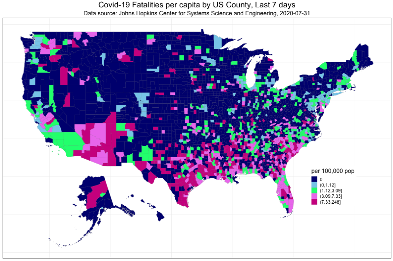
A choropleth map is a thematic map that colors geographic regions according to statistical values. The regions are usually administrative units such as countries, states, prefectures, municipalities, or census areas. Differences in color intensity or hue make regional patterns easier to see.
Choropleth maps are widely used for population density, income, voting rates, disease rates, risk indexes, and many other regional statistics.
Historical Background
One of the earliest well-known choropleth maps was created by Charles Dupin in 1826 to show literacy levels in France. During the nineteenth century, national statistics and thematic cartography developed together, making regional statistical maps increasingly common.
In the twentieth century, census mapping and government statistical reporting made choropleth maps a standard tool. GIS and web mapping later made them easy to create, publish, and interact with.
Data Structure
A choropleth map combines boundary geometry with regional attributes.
| Data | Role |
|---|---|
| Polygon geometry | Boundaries for each region |
| Region identifier | Key used to join geometry and statistics |
| Statistical value | Value used to determine color |
| Classification method | Optional grouping into color classes |
| Color scale | Visual encoding of value ranges |
Common geographic formats include GeoJSON, TopoJSON, and Shapefile. The statistical table must share a region code or name with the geometry.
Purpose
The purpose of a choropleth map is to show regional difference and spatial pattern. It helps readers see where values are high or low, whether neighboring regions are similar, and whether a phenomenon is concentrated in particular areas.
Choropleth maps work best for rates, ratios, densities, indexes, and other normalized values. Raw counts can be misleading because large or populous regions often dominate the visual pattern.
Use Cases
- Population density or aging rate
- Income, unemployment, or housing indicators
- Election turnout or vote share
- Disease incidence rate
- Disaster risk by administrative area
- Education, welfare, or infrastructure indicators
How to Read It
Start with the legend. Check what the colors mean, what value range each color represents, and whether the scale is sequential, diverging, or categorical.
Then check the unit of analysis. A map by prefecture and a map by municipality can show very different patterns from the same source data. Also confirm whether the values are raw totals or normalized rates. For choropleth maps, normalized values are usually more appropriate.
Classification
Many choropleth maps group continuous values into classes. Common methods include:
| Method | Effect |
|---|---|
| Equal interval | Uses evenly spaced value ranges |
| Quantile | Puts the same number of regions in each class |
| Natural breaks | Groups values around clusters in the data |
| Standard deviation | Shows distance from the mean |
| Continuous scale | Avoids class boundaries and uses a smooth gradient |
The classification method can strongly change the visual impression, so it should be chosen and documented carefully.
Design Notes
- Use rates, ratios, or densities instead of raw counts when region sizes differ.
- Choose color scales that match the data type.
- Use sequential colors for low-to-high values.
- Use diverging colors when values have a meaningful midpoint.
- Avoid too many classes; five to seven is often enough.
- Make boundaries visible but not visually dominant.
- Explain missing data clearly.
- Consider a cartogram or dot-density map when area bias is severe.
Strengths
- Familiar and easy to understand.
- Works well with administrative statistics.
- Reveals regional clustering and broad spatial patterns.
- Compact enough for reports, dashboards, and journalism.
Limitations
Choropleth maps are affected by region size and boundary choice. Large areas attract more visual attention even if their population is small. Different aggregation units can also produce different patterns, a problem related to the modifiable areal unit problem.
They are also weak for raw totals. If the goal is to show counts, a proportional symbol map, dot-density map, or cartogram may be more appropriate.
Alternatives
| Alternative | When to Use It |
|---|---|
| Dot-density map | Show spatial concentration with less area bias |
| Cartogram | Resize areas according to a value |
| Proportional symbol map | Show total quantities by symbol size |
| Isoline or isopleth map | Show continuous spatial phenomena |
| Bivariate choropleth map | Show two related variables together |
Summary
Choropleth maps are one of the most fundamental forms of thematic mapping. They are powerful for comparing normalized regional statistics, but the design depends heavily on classification, color scale, geographic unit, and data normalization.