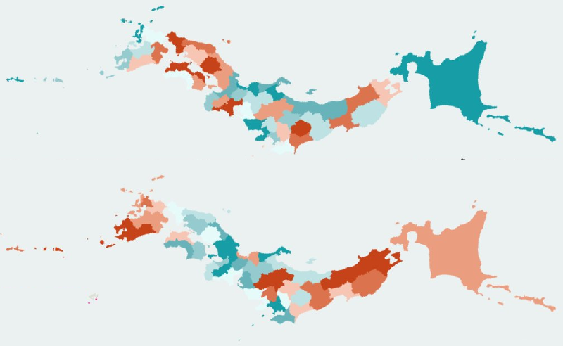
When a statistical map colors regions by value, it may be called a classified map or a choropleth map. Visually, the two can look almost identical: prefectures, municipalities, or other areas are shaded by color.
But conceptually, the terms point to different perspectives. Classification emphasizes how data values are grouped into classes. Choropleth mapping emphasizes the cartographic technique of coloring geographic areas.
What Classification Means
Classification is a data-processing step. Values are divided into ranges using methods such as equal interval, quantiles, natural breaks, or custom thresholds. The choice of classification can change the message of the map.
What a Choropleth Map Means
A choropleth map is a map representation technique. It colors areas such as administrative units according to values. The visual unit is the region, and the value is usually a rate, ratio, density, or other normalized measure.
Why the Distinction Matters
A choropleth map often uses classification, but classification can also be used in non-map charts. Likewise, a choropleth can be continuous or classified depending on the color scale. Separating the two concepts helps clarify whether a problem comes from data processing or from map design.
Design Notes
- Use normalized values for choropleth maps when area sizes differ.
- State the classification method.
- Avoid class breaks that distort interpretation.
- Use color scales that match the data.
Summary
Classified maps and choropleth maps overlap in practice, but they are not the same concept. Classification is about grouping data; choropleth mapping is about coloring geographic areas.