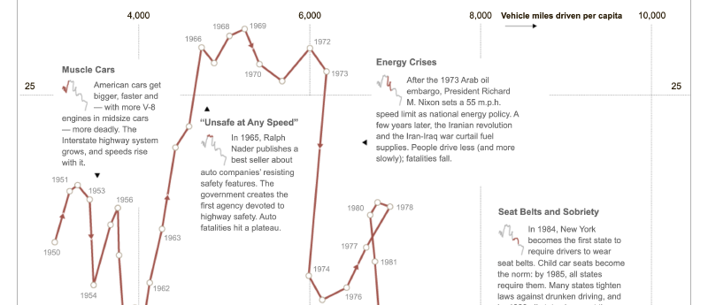
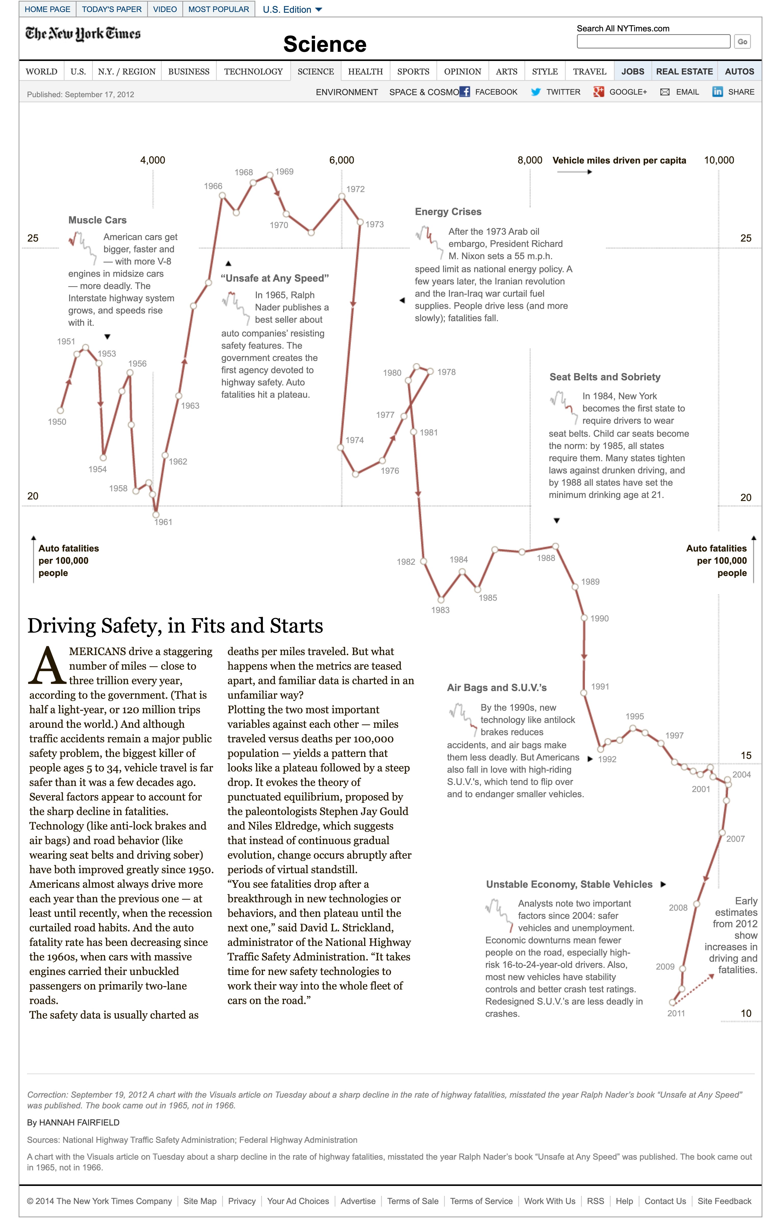
A connected scatterplot connects the points of a scatterplot in sequence, usually over time. A normal scatterplot shows the relationship between two variables as a cloud of points; a connected scatterplot emphasizes the path through those points.
It is especially useful for showing how the relationship between two variables changes over time.
Background
The connected scatterplot builds on the scatterplot tradition and became especially visible in journalism and data storytelling after the 2010s. Media organizations such as The New York Times and The Economist used it to show the changing relationship between economic and social indicators.
Haroz, Kosara, and Franconeri describe the form as a way to present paired time series.
Driving Safety, in Fits and Starts — NYTimes.com
Data Structure
| Variable | Type | Description |
|---|---|---|
| x | numeric | Horizontal variable |
| y | numeric | Vertical variable |
| t | time or order | Sequence variable |
Points are ordered by t and connected with lines.
Purpose
The chart shows direction, cycles, loops, and changing relationships rather than static correlation alone. It is often used for economic, environmental, health, and social indicators.
Strengths
- Shows both relationship and movement.
- Creates a narrative path through data.
- Can reveal loops or lagged relationships.
- Works well when annotated with dates or arrows.
How to Read It
Each point is one time period. The line shows how the data moved from one period to the next. A line moving up and right means both variables increased; a line moving down and right means the x variable increased while the y variable decreased.
Design Notes
- Use arrows or year labels to make direction clear.
- Avoid too many series in one chart.
- Keep axes and units clear.
- Consider smoothing only when it does not distort the story.
Alternatives
- Scatterplot for static correlation
- Line chart for one variable over time
- Animated scatterplot for time-based motion
- Vector plot when direction should be emphasized
Summary
Connected scatterplots turn a two-variable relationship into a path. They are powerful for storytelling, but need careful labeling because loops and crossings can be difficult to read.