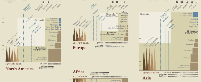
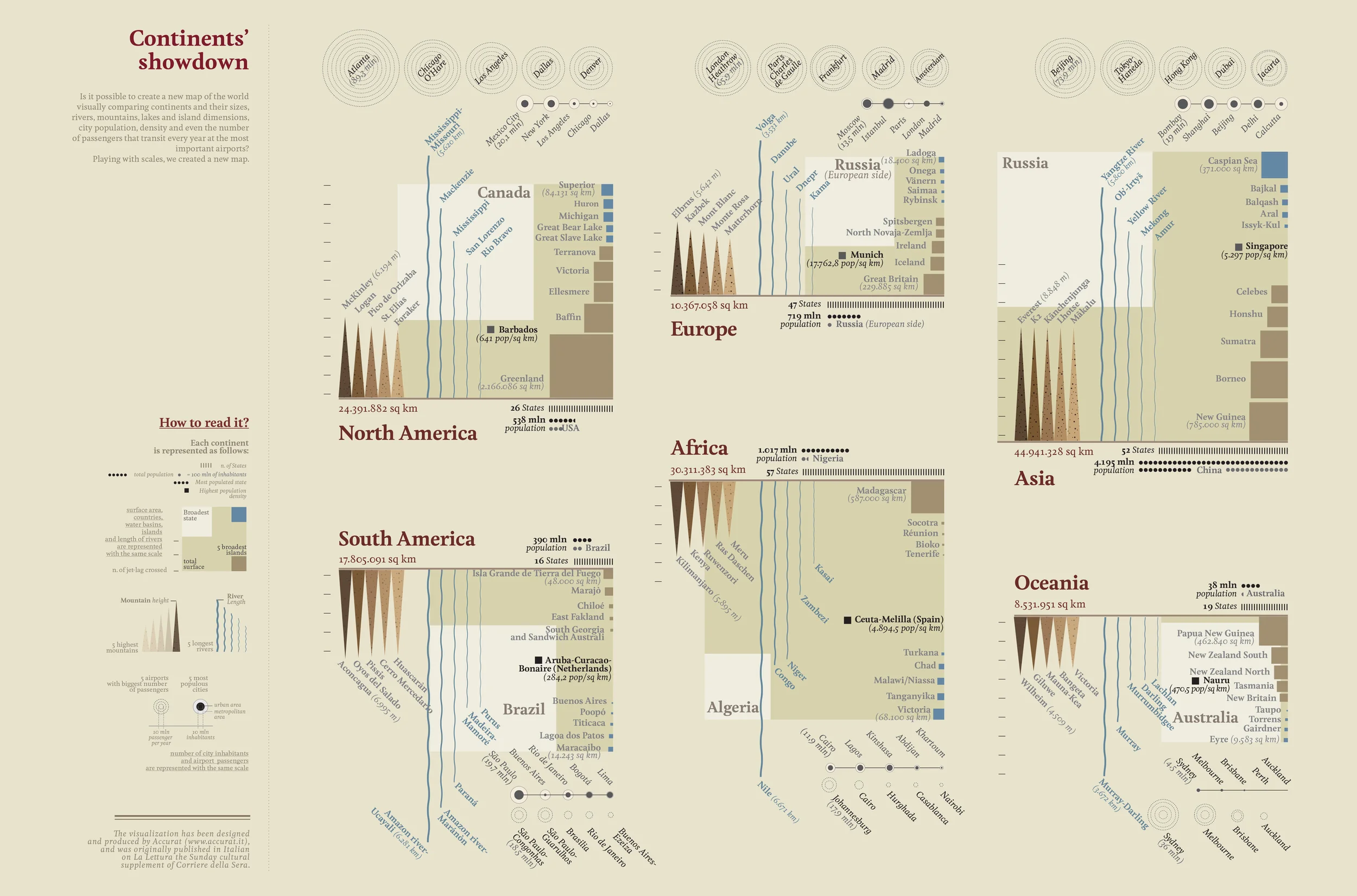
Continents’ Showdown, created by the Italian data visualization studio Accurat, compares the world’s continents through a shared visual scale. A conventional map preserves geographic position and projection rules; this work intentionally reorganizes the world around comparison.
Continents’ Showdown
The piece was created for the Visual Data series in La Lettura, the cultural supplement of Corriere della Sera. It can also be read as an early example of Giorgia Lupi’s later idea of “Data Humanism”: data is treated not as a set of isolated numbers, but as a cultural material for understanding the world.
How to Read the Legend
The “How to read it?” section at the bottom defines the common visual grammar used across all continents.
Basic Continental Structure
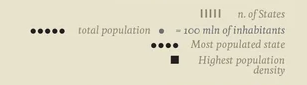
- Vertical strokes indicate the number of states.
- Black dots indicate total population, with one dot representing 100 million inhabitants.
- Large dot indicates the most populated state.
- Black square indicates the highest population density.
Area and Physical Geography
The following geographic elements are compared on the same scale:
- total surface area
- country area
- water basins and lakes
- islands
- river length
The legend also identifies the broadest state and the five broadest islands for each continent.
Movement and Distance
The number of time zones crossed gives a human-scale sense of a continent’s east-west span.
Natural Features
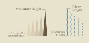
- Mountain height is represented by triangular forms for the five highest mountains.
- River length is represented by wavy lines for the five longest rivers.
Cities and Airports
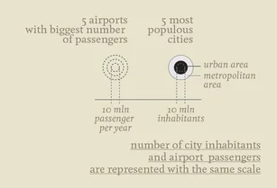
The lower portion compares human concentration and movement:
- the five airports with the largest number of passengers
- the five most populous cities
The graphic uses the same scale for city inhabitants and airport passengers, treating urban population and travel flow as related expressions of human movement.
Concept
Accurat prioritizes cognitive comparison over geographic literalness. The visualization is not a replacement for a map; it is a device for asking new questions. What does it mean for a continent to be “large”? Is scale measured by area, population, rivers, mountains, airports, or cities?
Summary
“Continents’ Showdown” turns continents into comparable data portraits. By placing geography, population, nature, and mobility into a unified system, it helps readers feel the world through multiple scales at once.