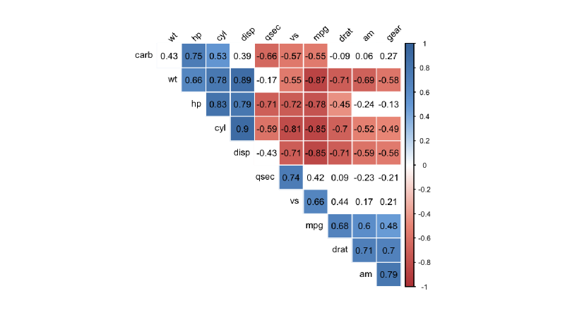
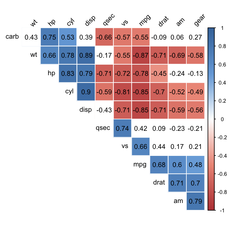
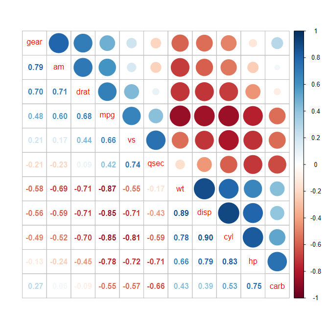
A correlogram visualizes correlations among multiple variables in matrix form. Variables appear on both axes, and each cell encodes the correlation coefficient through color, size, shape, or numeric labels.
Purpose
The purpose is to give an overview of correlation structure: strong positive relationships, strong negative relationships, and weak or absent relationships.
Design Notes
- Use a diverging color scale centered on zero.
- Keep the variable order meaningful.
- Show values when precision matters.
- Remember that correlation does not imply causation.
Summary
Correlograms are compact summaries of relationships among many variables. They focus on strength and direction, while scatterplot matrices show the actual shape of relationships.