This work by Italian infographic designer Federica Fragapane shows the relationship between education level and life expectancy through a multivariate visual system. It was created for La Lettura, the cultural supplement of Corriere della Sera, and explores how education, wealth, family structure, urbanization, and longevity move together across countries.
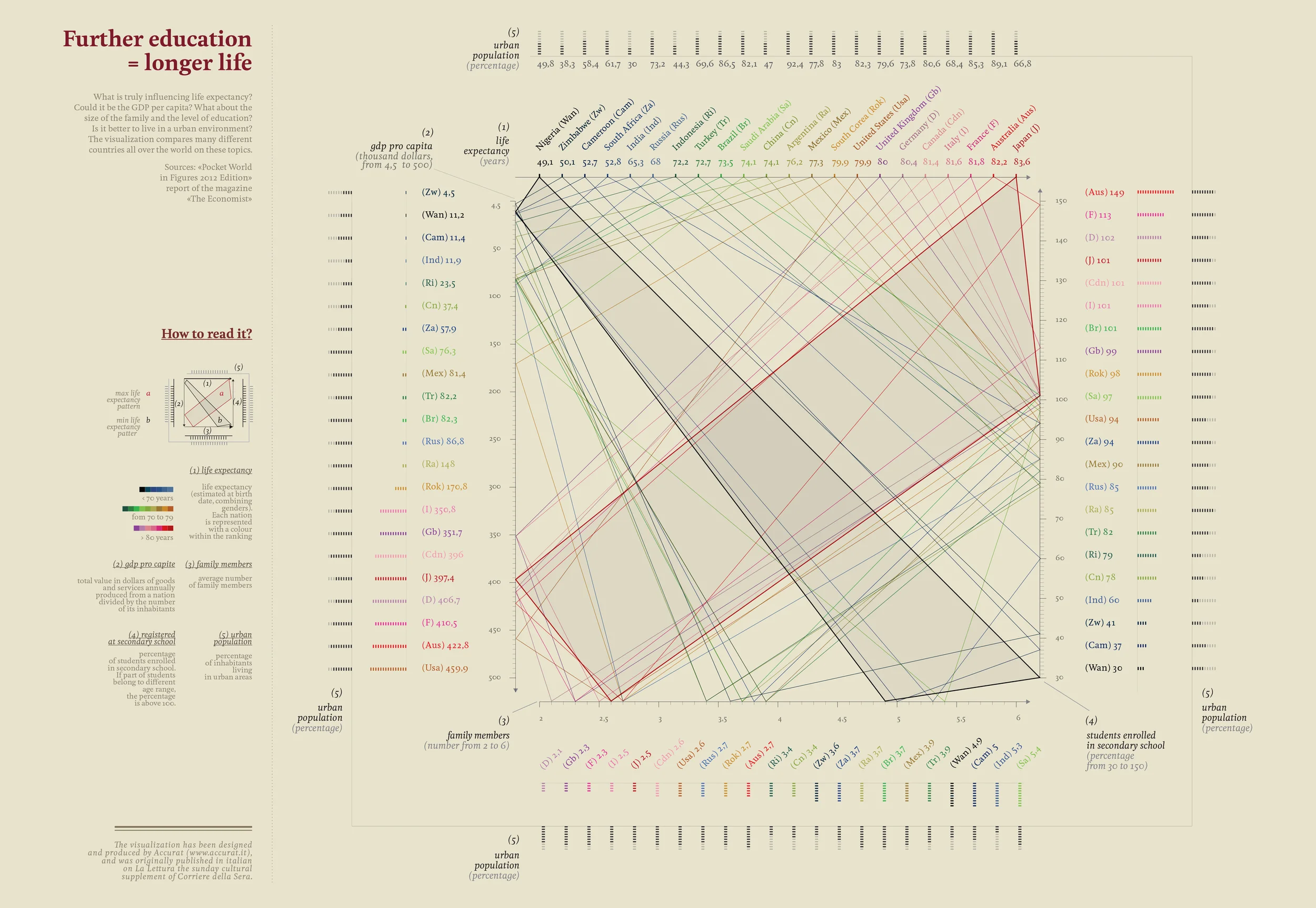
The data sources include The Economist and Pocket World in Figures. Each country can be compared across GDP, life expectancy, urban population share, family size, and secondary-school enrollment.
How to Read It
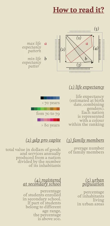
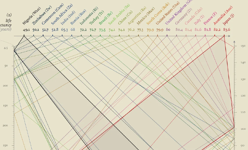
The visualization arranges five variables within a square structure. Each country is represented by a line that passes through the axes, creating a compact profile of its social and demographic conditions.
Color represents life-expectancy range across the whole graphic:
- Blue: below 70 years
- Green: 70-79 years
- Red: 80 years or older
Overall Structure
Axes 1-4 sit on the four sides of the square. Axis 5, urban population, wraps around the outer edge. This makes urbanization the broader context surrounding life expectancy, GDP, family size, and education.
1. Life Expectancy
The left axis shows life expectancy at birth. Countries with longer lives appear higher.
2. GDP per Capita
The lower axis shows economic output per person. Higher values move to the right and often align with education and longevity.
3. Family Members
This axis shows average household size. Smaller households are often associated with urbanized and highly educated societies.
4. Secondary School Enrollment
The right axis shows access to secondary education. Some countries can exceed 100% because of statistical coverage across age groups.
5. Urban Population
The outer axis shows the share of people living in urban areas, framing the other variables as part of a broader urban social system.
Interpretation
Lines extending upward and rightward tend to indicate higher education, higher GDP, longer life expectancy, smaller household size, and greater urbanization. Lines concentrated lower and leftward tend to indicate lower education, lower GDP, larger households, and shorter life expectancy.
Background
The work visualizes a long-discussed relationship in public health and social science: education is correlated with health and longevity. Education can shape income, health literacy, social participation, and access to care. Fragapane’s design avoids reducing that relationship to a single scatterplot and instead lets readers experience several variables together.
Note
The visualization shows correlation, not direct causation. It does not claim that education alone causes longer life; rather, it shows how education, economy, family structure, urbanization, and health tend to appear together.