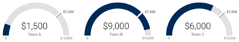
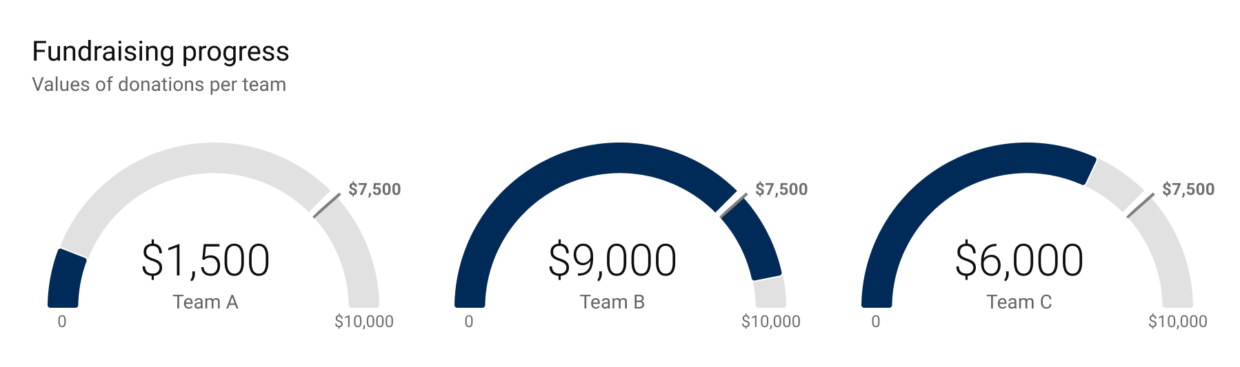
A gauge chart shows a single value on a circular or semicircular scale, often with a needle like a speedometer. It is commonly used to show where a current value sits relative to a target, threshold, or acceptable range.
Use Cases
- Dashboard KPIs
- Operational monitoring
- Performance against target
- Status displays
Design Notes
- Use gauges for quick status, not detailed analysis.
- Show thresholds clearly.
- Avoid wasting too much dashboard space.
- Consider bullet charts or bar charts when comparison matters.
Summary
Gauge charts are familiar and easy to scan, but they are space-inefficient and limited to simple status messages. Use them when the metaphor of a meter helps the audience.