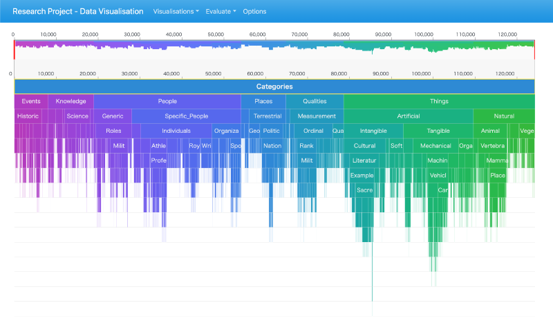
This article collects examples related to Examples of Icicle Charts. It is useful for comparing how the same visualization idea changes across topics, datasets, and publication contexts.
The examples show how a visualization technique can be adapted to different subjects and audiences.
What to Look For
When reading these examples, compare the data structure, the visual encoding, and the intended reading task. Similar chart types can communicate very different messages depending on annotation, ordering, scale, and color.
Design Notes
- Compare the examples by asking what task each design supports.
- Look for differences in scale, annotation, color, and layout.
- Notice whether the design emphasizes overview, comparison, storytelling, or exploration.
- Use the examples as references, not as fixed templates.
Summary
These examples are best read as a design reference. They show not only what the technique can express, but also where layout, labeling, and editorial framing determine whether the result is readable.