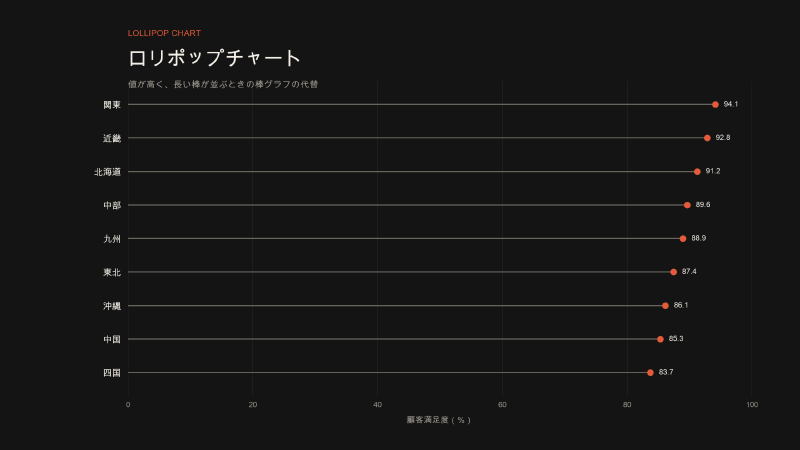
A lollipop chart replaces the thick bar of a bar chart with a thin line (the stick) and marks the value with a circle (the candy). Functionally it is the same as a bar chart: it compares quantities across categories.
The name spread in March 2011, through a pair of blog posts by Andy Cotgreave, then at The Data Studio (InterWorks). The problem he was trying to solve was not a new data structure. It was that a bar chart with many long bars is unpleasant to look at.
Drawing a line from a zero baseline to a point, however, is older. William S. Cleveland described it as a variant of the dot chart a quarter-century earlier. Cotgreave is less the inventor of the form than the person who named it, defined a use for it, and spread it through the Tableau community.
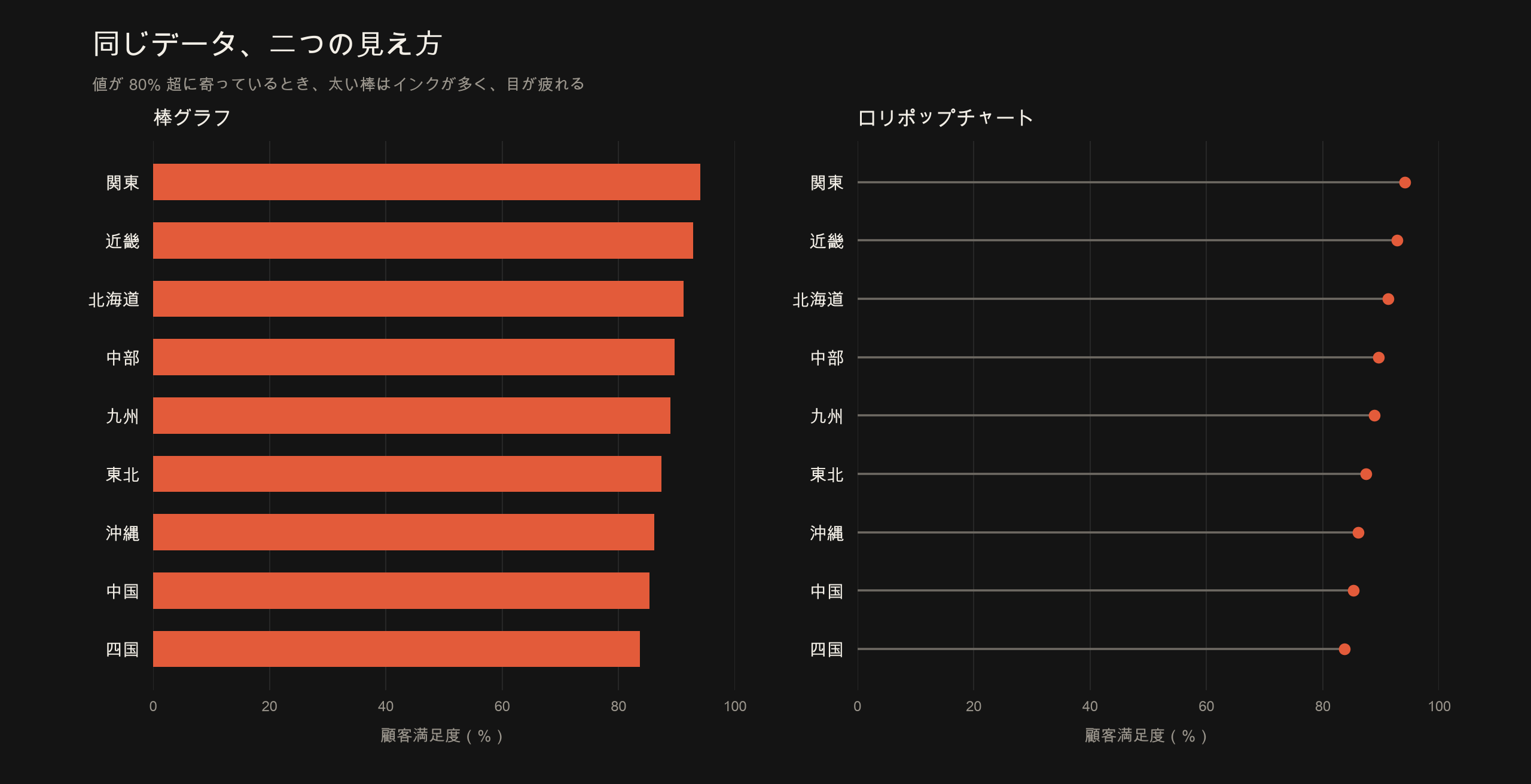
Fictional satisfaction scores, all above 80%. The bars on the left use a lot of ink; the lollipops on the right mark each value with a circle.
Also called
- Lollipop plot
- A hybrid of a bar chart and a dot plot (a descriptive label, not a formal name)
The lollipop graph in graph theory—a complete graph joined to a path—is a different object. Stephen Few later noted that Cotgreave was not aware of that mathematical term when he adopted the name for charts.
Historical background
1984–1985: Cleveland’s dot charts
William S. Cleveland proposed the dot chart in Graphical Methods for Data Presentation: Full Scale Breaks, Dot Charts, and Multibased Logging (The American Statistician, 1984). It was an alternative to the bar chart. The quantity is read from the position of the point.
The next year, Cleveland and Robert McGill’s Graphical Perception and Graphical Methods for Analyzing Scientific Data (Science, 1985) described something close to today’s lollipop:
When the baseline for the graph is zero […], the dotted lines can end at the data dots; the data can be visually decoded by judging the positions of the data dots along the horizontal scale or by judging the lengths of the dotted lines.
If there is no zero (or some other meaningful baseline), they wrote, the lines should run across the whole plot area. Stopping at the dots would encode a meaningless length.
So by the 1980s the distinction was already in the primary literature:
- Zero baseline → the line may stop at the dot (length can be read)
- No zero baseline → the line should cross the plot (position only)
The second case is the Cleveland dot plot. The first already looks like a lollipop.
Around 2004: Few warned against the form before it had this name
In a 2017 post, Stephen Few wrote that graphs of this type existed in the wild before Cotgreave named them, and that he had been warning against them in his Show Me the Numbers course since 2004. Excel drop lines, he said, made it easy to stop a line at the dot. That is Few’s own recollection; the course materials themselves have not been checked here. It is still useful for separating the birth of the name from the birth of the drawing.
March 2011: Cotgreave named it and stated a purpose
On 10 March 2011, Cotgreave published Lollipop charts: the search for the perfect mark (part one). Lollipop charts: part two followed on 17 March. He built them in Tableau 6 by overlaying a thin bar and a circle on a dual axis.
Part two opens with the purpose:
I explained how I stumbled across the lollipop chart as a way of displaying data when the values are all very high.
In 2012, Ben Jones of Applied Visual Analytics quoted features from part one, which was still online then:
- Useful when every category has a high value (long or tall bars)
- Greatly reduces the data-ink ratio while keeping a clear link to the axis labels
- People he showed it to found it both pretty and easy to read
- It still works when you add dimensions and make small multiples
In 2017, after Few called lollipops “malformed bar graphs,” Cotgreave restated the original problem in Lollipop charts, revisited:
Problem: A bar chart with many bars of a long length are unpleasant to look at.
Fat bars are too inky. Thin lines lack definition. Lollipops, he wrote, are a compromise. Few’s example—few bars with a large range—was not the situation he had designed for.
In a footnote he also addressed invention:
Did I invent lollipop charts? Alberto Cairo credited me with their invention in his book The Truthful Art, and I’m not going to argue against that!
Cairo’s The Truthful Art (2016) is more cautious. He credits Cotgreave with the term, not with inventing the drawing:
I think that it was Tableau’s visualization designer and data analyst Andy Cotgreave who came up with this term.
In short:
| What happened | Who | When |
|---|---|---|
| Wrote that lines may stop at the dots when the baseline is zero | Cleveland | 1984–1985 |
| Named the “lollipop chart” and popularized it as an alternative to many long bars | Cotgreave | 2011 |
| Introduced the name in a book | Cairo | 2016 |
| Criticized it as a weaker bar graph | Few | 2017 (in courses from 2004, by his account) |
After the name stuck
Once the chart had a name, tools absorbed it.
- A 2017 Tableau blog post presents Cotgreave’s tutorial as the starting point.
- Bob Rudis’s R geom
ggalt::geom_lollipop()says in its help text that lollipop charts are “the creation of Andy Cotgreave going back to 2011.” - Highcharts ships a
lollipopseries. Its docs use almost the same rationale as Cotgreave: when values sit around 90% of the range, the chart avoids a Moiré effect and is less visually aggressive.
Data structure
The same as a bar chart: a category and one number.
| Category | Value |
|---|---|
| Country A | 92 |
| Country B | 88 |
| Country C | 85 |
If each item has two values (last year and this year, men and women), the chart is a range plot or dumbbell, not a lollipop.
Purpose
Cotgreave’s own purpose comes down to one sentence.
When many categories have high values, reduce the ink and pressure of thick bars, while keeping the link between labels and values.
The comparison figure at the top of this article is that problem. Bars encode magnitude with length, but when every value sits near the top of the scale, most of the plot is filled in. A lollipop thins the bar to a line and keeps a circle at the value.
In part two he also wrote that the benefit was not only visual:
I’ve started using this technique regularly as it engages users, and improves the data-ink ratio without sacrificing interpretation.
Cairo, commenting on Few’s post, put it another way. Bar charts with more than eight or nine bars can look busy; lollipops add white space. Marking the value at the center of the circle is a bit less precise, but you can shrink the circle or mark the value at its edge. Thin bars alone would also work, but the circle makes the point easier to find.
Use cases
They fit the conditions Cotgreave and Highcharts described:
- Values clustered near the top of the scale, so every bar is long (for example, attainment of 80–95%)
- Many categories, so thick bars fill the plot
- Small multiples of the same shape
- Labels or icons at the end of the bar (in Tableau, the circle can be swapped for a shape)
They fit poorly in the cases Few and Andy Kriebel pointed out:
- A small number of bars with a wide range (an ordinary bar chart is enough)
- An axis that does not start at zero (the stick’s length then lies)
- Tiny differences that need precise length comparison (a bar’s flat end is easier to read)
Characteristics
| Strength | Less ink when values are high. The point marks the value; the line ties it to the label. |
| Weakness | The value is the center of the circle. If the line reaches the outer edge, length overstates the value. |
| Fits | One number from a zero baseline, many categories, values bunched high |
| Does not fit | Non-zero baselines, stacked bars, precise comparison of nearly equal values |
Few’s core criticism is here. A bar encodes value twice: as length and as the position of its end. A lollipop thins the length cue and rounds the end. The center of the circle is the value, yet half the circle sits beyond it.
Similar points appeared immediately in the comments on the 2011 part two post. Joe Mako argued that a line stopping at the dot becomes a pattern the eye follows. If the line crosses the whole plot, it recedes into the background and comparison returns to the dots. That is the same logic as Cleveland’s “if there is no zero, run the line across.”
How to read it
| Element | What it means |
|---|---|
| Category axis | Item names. Horizontal lollipops are easier when labels are long. |
| Value axis | Start at zero, as with a bar chart. |
| Line (stick) | Length from zero to the value. A substitute for the bar. |
| Circle (candy) | The value. Read the center of the circle. |
Highcharts’ docs close a common misreading in advance: the value is not the outer edge of a bar, but the center of the point.
Design notes
- Keep a zero baseline. The same constraint as a bar chart.
- Keep the circles small. Both Cairo and Few treat large circles as a loss of precision.
- Make the line lighter than the circle. Cotgreave wrote in part two that if line and circle share the same intensity, the circle loses.
- Sort. Comments from 2011, in the Naomi Robbins tradition, note that alphabetical order is rarely best.
- Keep bars when nearby values must be compared. Tableau’s 2017 post also says unsorted lollipops of similar length are harder to compare than bars.
Examples
1. Cotgreave, 2011: customer satisfaction (high values)
The first published example plotted Tableau customer satisfaction by state and segment. How to build it was described in the 2011 part two post. Cotgreave later wrote that the original images were gone; the figures below are the ones he republished in his 2017 revisit. The values sit close together, so thick bars use a lot of ink—the problem he had set for himself.
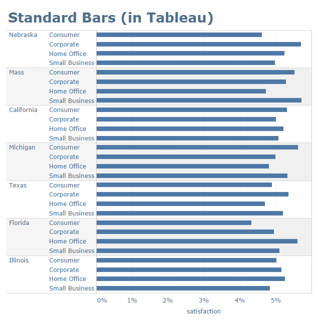
From Andy Cotgreave, Lollipop charts, revisited (2017). The bar chart he captioned “My eyes! They hurt!”
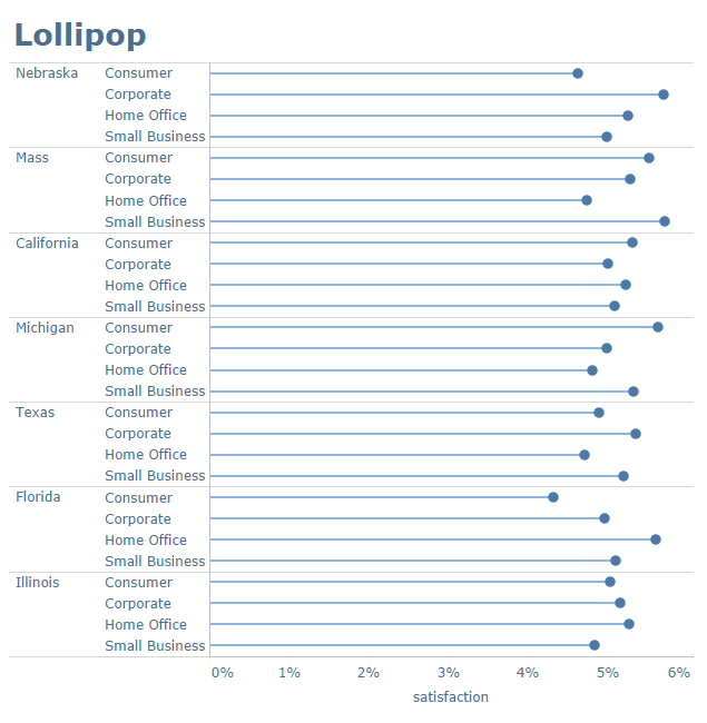
From the same post. The same data as lollipops. He captioned it “Easy on the eye.”
2. Washington Post, 2013: statutory retirement ages
The Washington Post showed government retirement ages with dots and lines (Retirement getting further away, graphic: Tobey). Andy Kriebel (VizWiz) introduced it as a lollipop in July 2012 and credited Cotgreave’s part two. The figure below is the version the paper published on 19 March 2013.
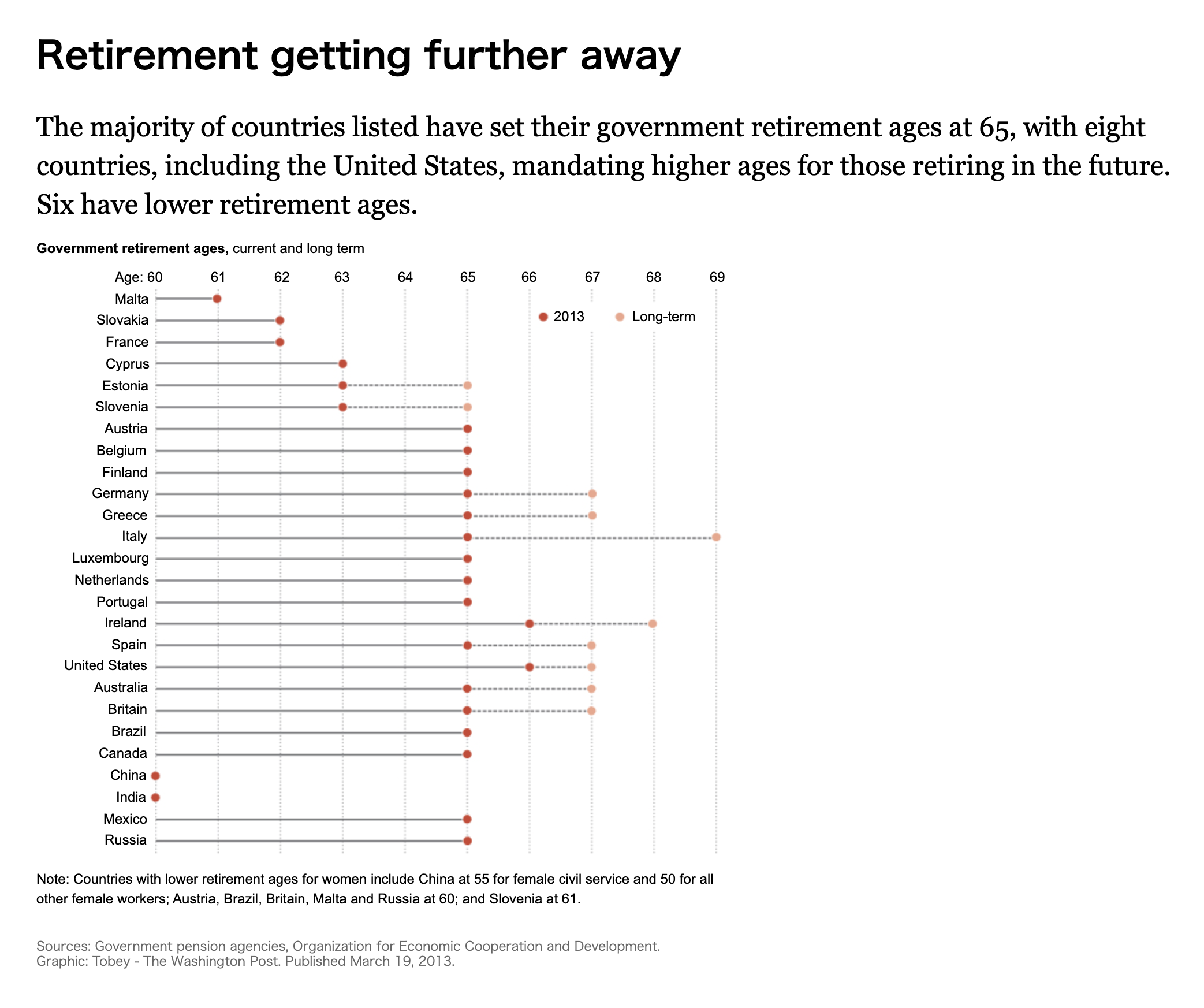
From The Washington Post, Retirement getting further away (2013). Graphic: Tobey. Dark red is 2013; the lighter dot is the long-term age.
Kriebel added an important caveat in that post. The axis starts at 60. If the stick ran to zero, Malta would look five times lower than Austria. If the scale does not start at zero, drop the stick and use a dot plot. This figure is also close to a range plot or dumbbell: two points joined by a line. A chart that looks like a lollipop in journalism may still fail Cleveland’s condition (is there a zero baseline?).
3. The Guardian, 2012: physical inactivity
On 18 July 2012, the Guardian Data Blog showed “the world’s least physically active population” from The Lancet data, using Tableau Public. The original article is Which are the laziest countries on earth?. Ben Jones treated it as a Cotgreave lollipop and rebuilt it as a dot plot, arguing the lollipops took too much space. The episode shows how quickly the form spread, and how quickly people asked whether it was always a good substitute for bars. The original Tableau embed is no longer easy to archive as a still.
4. Implementation in tools (Highcharts)
Highcharts has a dedicated lollipop series. The rationale in its official demo is close to Cotgreave’s: when values sit near the top of the range, avoid Moiré and visual aggression. Construction is in the lollipop series docs. In ggplot2 the usual recipe is geom_segment() plus geom_point(), or ggalt::geom_lollipop(). Rudis’s package help credits Cotgreave, 2011.
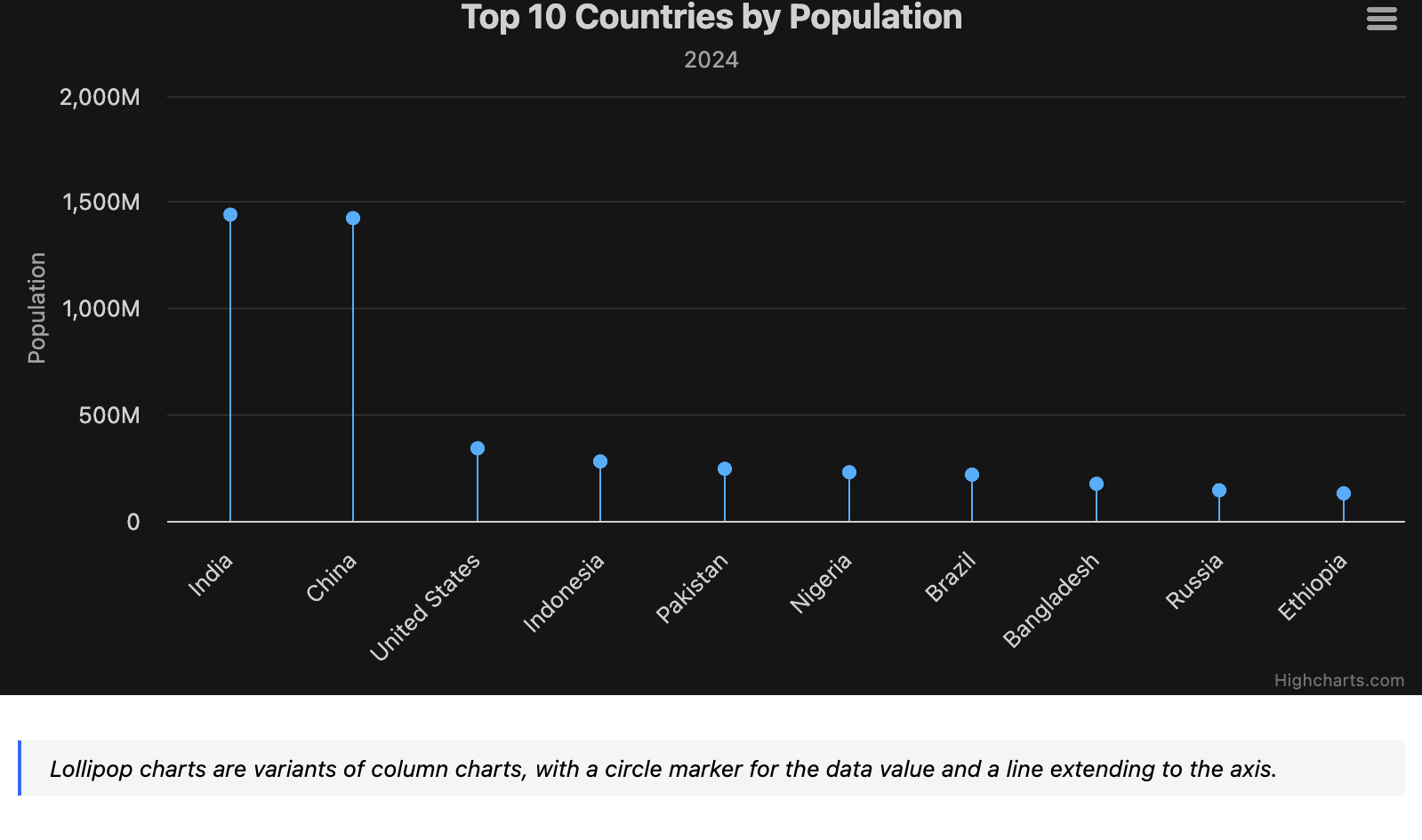
From the Highcharts lollipop series demo. The official description: a variant of a column chart, with a circle for the value and a line to the axis.
Alternatives
| Chart | Use when |
|---|---|
| Bar chart | Zero-baseline magnitude comparison, not too many categories |
| Cleveland dot plot | Non-zero baseline, or you want position alone |
| Range plot / dumbbell | Two values per item (last year and this year, and so on) |
| Thin bar chart | You want less ink but not the imprecision of a circle |
A lollipop is a relative of the bar chart, not of a distribution dot plot. Connecting two values with a line belongs with range plots.
Summary
The lollipop chart is less a new encoding than a compromise that thins a bar chart.
- Cleveland (1984–85) wrote that lines may stop at the dots when there is a zero baseline.
- Cotgreave (2011) added a candy-like circle and named the result as a way to ease the look of many long bars.
- Cairo spread the name; Few argued that bars remain more accurate.
The safest use is the problem Cotgreave actually set. Values are high, bars are long, and the plot is too inky. Then consider a lollipop as a substitute for bars. If the axis does not start at zero, even a chart called a lollipop is better returned to a dot plot. That is the practical conclusion from the primary sources.
References
- Andy Cotgreave, “Lollipop charts: part two” (2011-03-17)
- Andy Cotgreave, “Lollipop charts, revisited” (2017-05-19)
- William S. Cleveland, “Graphical Methods for Data Presentation…” (The American Statistician, 1984)
- Cleveland & McGill, “Graphical Perception…” (Science, 1985)
- Alberto Cairo, The Truthful Art (2016), around p. 28
- Stephen Few, “Lollipop Charts: ‘Who Loves You, Baby?’” (2017-05-17)
- The Washington Post, “Retirement getting further away” (2013-03-19)
- Andy Kriebel, VizWiz, Washington Post retirement-age reconstruction (2012-07)
- The Guardian, “Which are the laziest countries on earth?” (2012-07-18)
- Ben Jones, “Lazy Countries without the Lollipops” (2012); source of the part-one feature list
- Tableau, “Viz Variety Show: When to use a lollipop chart…” (2017-01-05)
- Highcharts, Lollipop series
- ggalt::geom_lollipop help (attribution to Cotgreave, 2011)
- Data Viz Project, Lollipop Chart