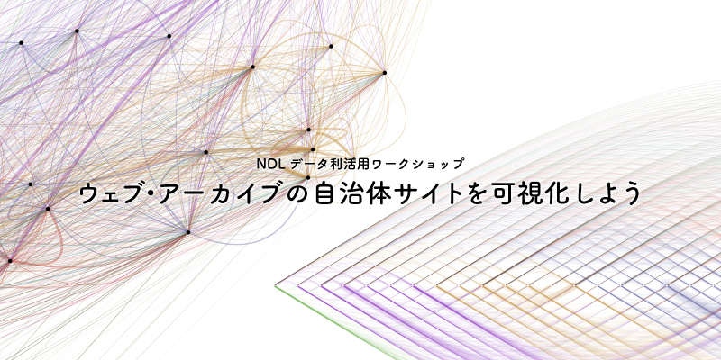
This article examines The National Diet Library’s First Data Visualization Event as a case study in data visualization, information design, or visual culture.
The article is useful as a case study in how data, design choices, and context shape interpretation.
What It Shows
The main point is not only the finished visual form, but also the reasoning behind it: what was selected, emphasized, simplified, or compared. Those decisions determine what readers can notice.
Design and Context Notes
- Identify the data, audience, and communication goal behind the work.
- Notice how visual form, annotation, and context shape interpretation.
- Distinguish the core idea from details that belong to a specific medium or moment.
- Treat the example as a prompt for design judgment rather than a universal rule.
Summary
The National Diet Library’s First Data Visualization Event shows how visualization works as both analysis and communication. Reading it carefully means looking at the data, the visual encoding, and the cultural or practical context around the work.