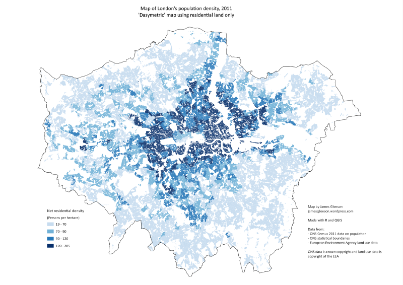
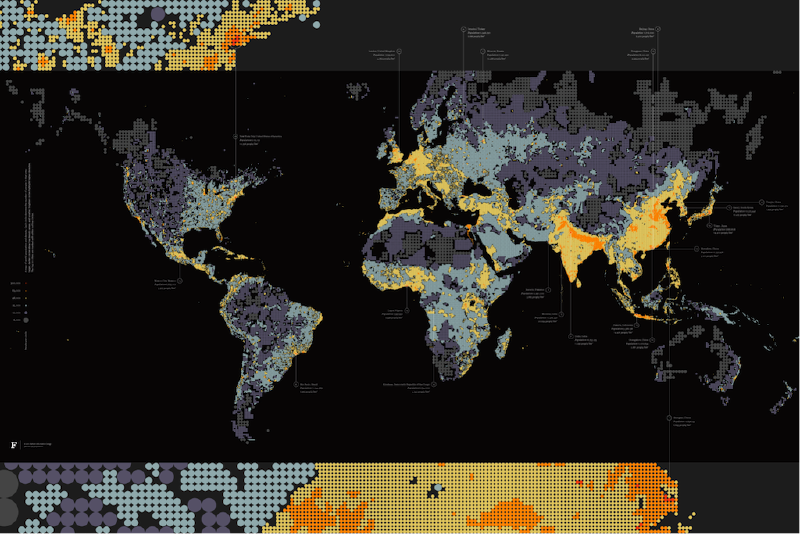
A dasymetric map refines choropleth mapping by using ancillary information, such as land use or land cover, to redistribute values within administr...
This article collects examples related to Examples of Dasymetric Maps. It is useful for comparing how the same visualization idea changes across to...
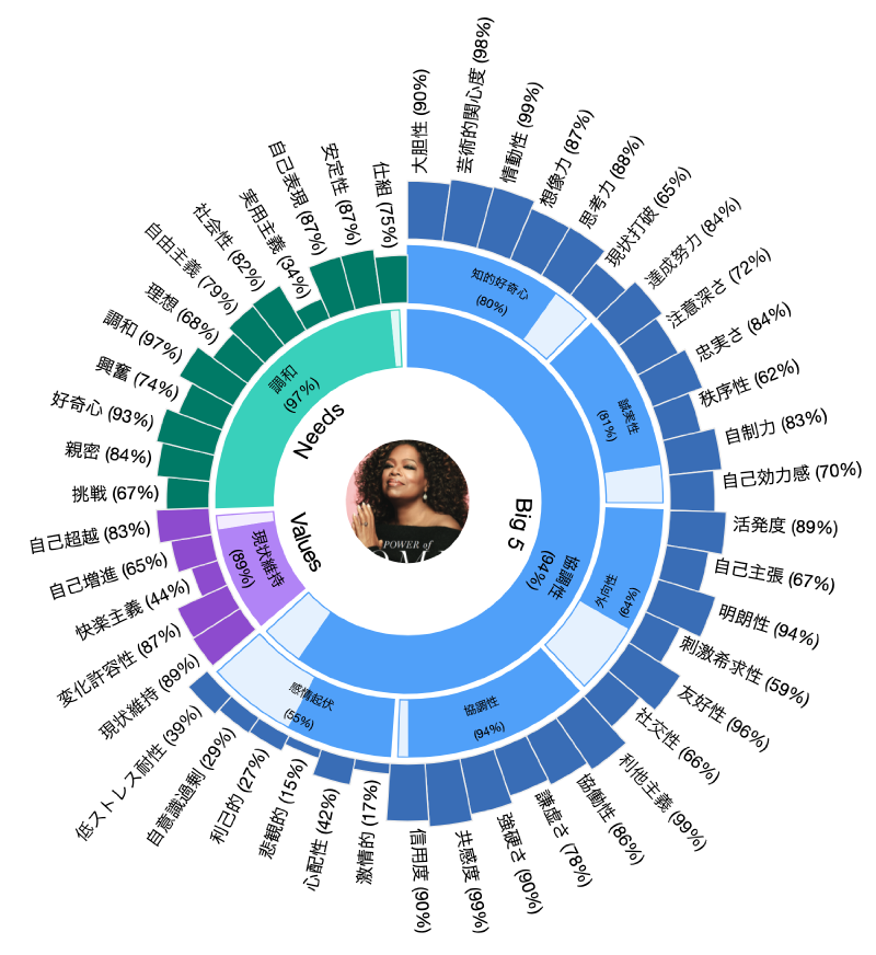
This article collects examples related to Examples of Sunburst Charts. It is useful for comparing how the same visualization idea changes across to...
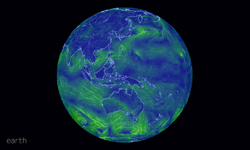
This article collects examples related to Examples of Vector Field Maps. It is useful for comparing how the same visualization idea changes across...
This article collects examples related to Examples of Icicle Charts. It is useful for comparing how the same visualization idea changes across topi...
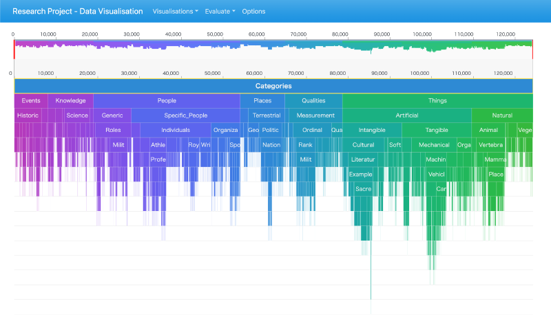
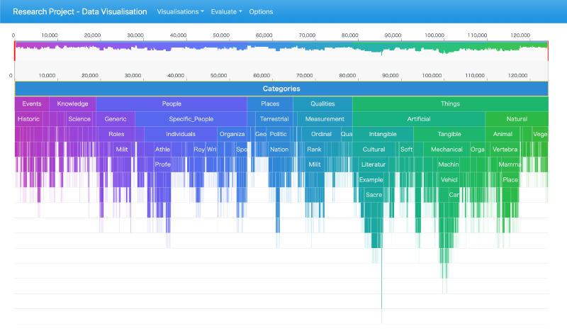
An icicle chart represents hierarchical data as nested rectangles arranged in horizontal or vertical layers.
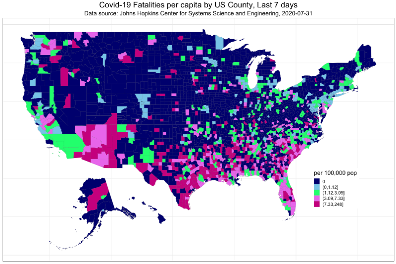
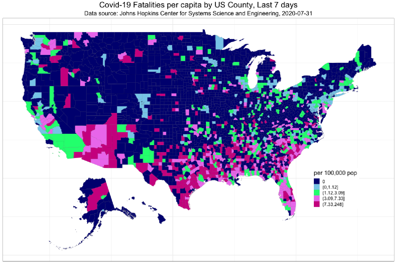
A thematic map that colors regions according to statistical values.
This article collects examples related to Examples of Choropleth Maps. It is useful for comparing how the same visualization idea changes across to...
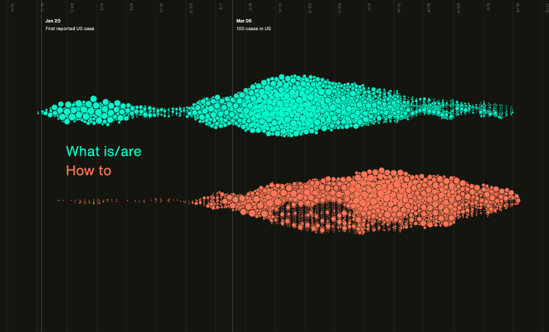
This article collects examples related to Examples of Beeswarm Plots. It is useful for comparing how the same visualization idea changes across top...
This article collects examples related to Examples of Dot Density Maps. It is useful for comparing how the same visualization idea changes across t...