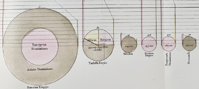
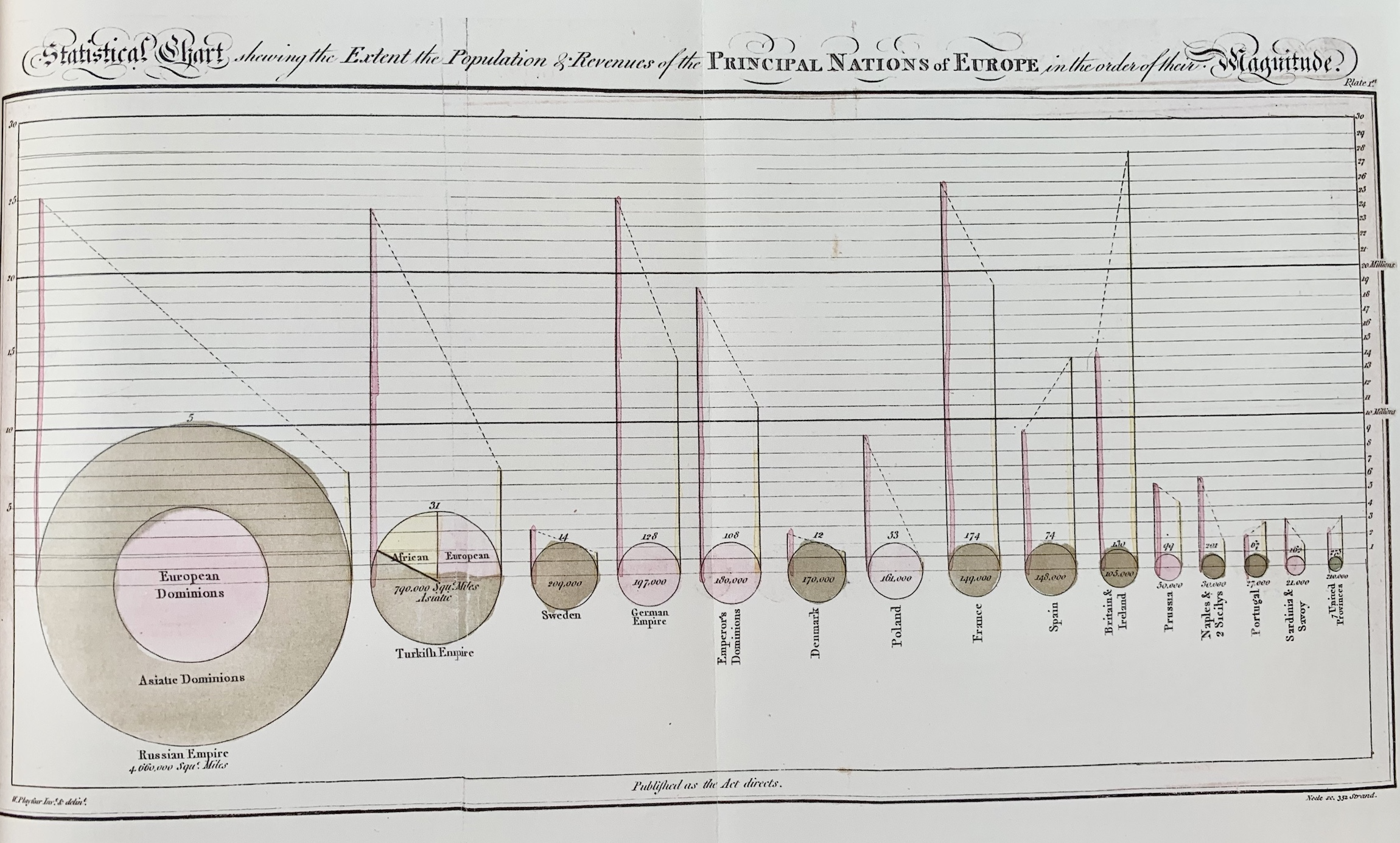
This chart appeared in William Playfair’s 1801 book The Statistical Breviary. Its full title describes a statistical chart showing the extent, population, and revenues of the principal nations of Europe in order of magnitude.
The chart attempted to compare three different quantities at once: territory, population, and national revenue. It is one of the earliest examples of multivariate visualization.
Why It Matters
Playfair’s work shows that the pie chart did not emerge as a simple decorative form. It was part of a broader effort to make national statistics visible and comparable.
Reading the Chart
The circular forms encode territorial size, while internal divisions and annotations provide additional comparisons. The result is not identical to the modern pie chart, but it demonstrates the early experimentation that led to circular proportional graphics.
Summary
The invention of the pie chart belongs to a wider history of trying to compare complex national statistics visually. Playfair’s circular diagrams remain important because they show statistical graphics taking shape before modern conventions were fixed.