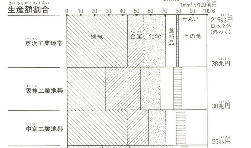
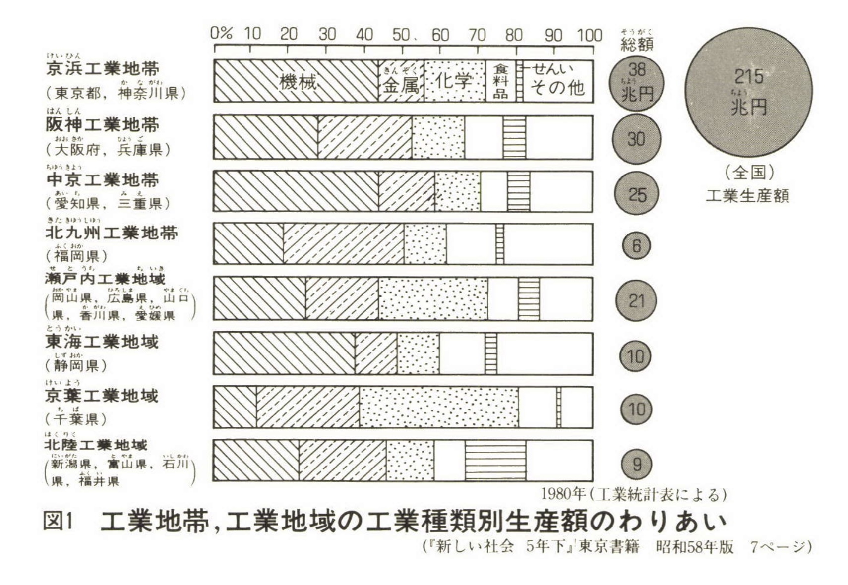
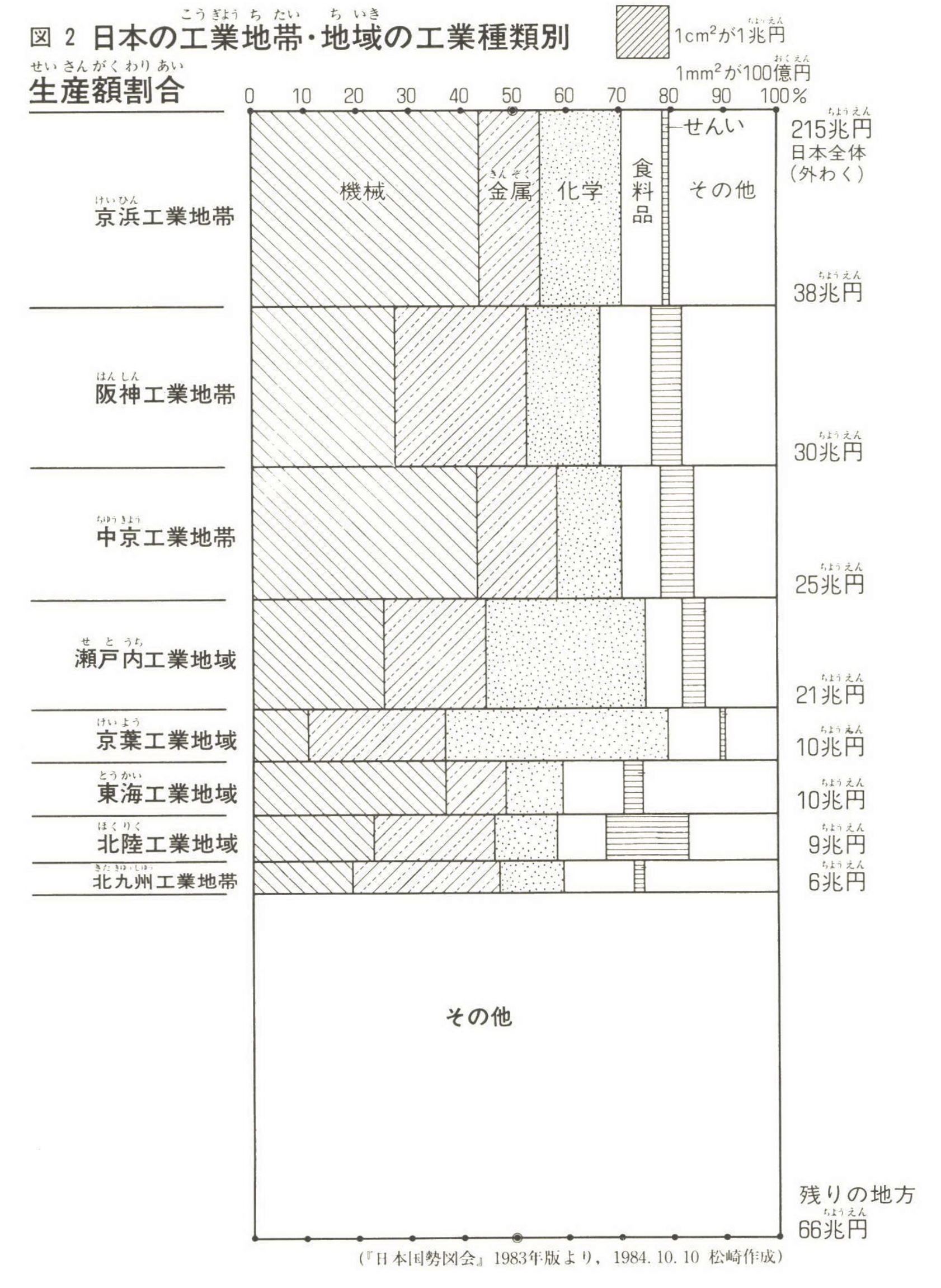
A quantity-proportion graph uses rectangular area to represent both absolute quantity and proportion. One dimension represents the size of a category, while the other dimension divides that category by composition. Each small rectangle’s area corresponds to quantity multiplied by proportion.
Internationally, similar methods are known as mosaic plots in statistics and Marimekko charts in business. The Japanese term “量率グラフ” emerged through education and popularization in Japan.
Examples
Total Amount Shown by Bar and Circle Area
The Same Data as a Quantity-Proportion Graph
Timeline of the Term
- Mid-1950s onward: Kiyonobu Itakura later recalled using this kind of graph for about 30 years.
- Late 1970s to early 1980s: Itakura introduced the graph in a study group on self-sufficiency rates. Hirotsugu Shiono proposed the name “quantity-proportion graph.”
- Around 1982-1983: Shigehiro Matsuzaki became interested in the method and introduced it in elementary-school lessons.
- June 1984: Matsuzaki published an article in Tanoshii Jugyo, where the term appeared clearly in print.
- January 1985: Matsuzaki’s book Shakai o Minaosu Megane was published with the term in the subtitle.
Roles of the Three Figures
- Kiyonobu Itakura: long-time practitioner who introduced the method in study groups.
- Hirotsugu Shiono: proposed the Japanese name.
- Shigehiro Matsuzaki: brought the method into classrooms and spread it through articles and books.
Mechanism
- Vertical dimension: proportional to total amount
- Horizontal dimension: proportional composition within the category
- Rectangle area: amount represented by the intersection cell
This allows readers to see both volume and composition at once.
Naming
- Mosaic plot: statistical name
- Marimekko / Mekko chart: business-dashboard name
- Quantity-proportion graph: Japanese educational name
The Japanese explanation often says “vertical = quantity, horizontal = proportion.” More precisely, both dimensions are relative scales, and the area is what encodes the resulting quantity.
Summary
The term “quantity-proportion graph” arose from Japanese educational practice in the 1980s. Although the chart can be understood internationally as a kind of mosaic or Marimekko chart, its Japanese history is distinctive because it spread through classroom use and educational writing.