Tableau is one of the world’s most widely used data visualization tools, and its color schemes are central to how users read data. Color is not decoration: it conveys meaning, guides attention, and affects accessibility. This article traces the evolution of Tableau’s color design from the early 2000s, through the Tableau 10 release in 2016, to more recent changes around dynamic color ranges.
These changes reflect progress in visual perception research and user experience. The influence of color scientist Maureen Stone is especially important, and accessibility, color-vision diversity, and perceptual precision have remained consistent themes.
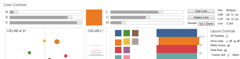
Early Tableau: Practical but Limited Palettes
Early Tableau palettes were designed to make charts attractive and immediately usable. They helped users create dashboards quickly, but the defaults were not yet as carefully tuned for perceptual uniformity or accessibility as later palettes.
As Tableau became a mainstream analytical tool, color had to support a wider range of use cases: categorical comparison, sequential magnitude, diverging values, highlighting, and dashboards viewed by many different audiences.
Tableau 10 and the Palette Redesign
The 2016 release of Tableau 10 marked a major redesign of the default palettes. The new colors were less saturated, more balanced, and better suited to repeated dashboard use. Tableau’s design team emphasized that the palettes were not simply aesthetic updates; they were built to improve legibility and reduce accidental emphasis.
The Tableau 10 categorical palette became widely recognized because it offered distinct colors without the harshness common in older default palettes. Sequential and diverging palettes also became more carefully aligned with perceptual principles.
Dynamic Color Ranges
More recent Tableau releases introduced more flexible handling of color ranges. Dynamic color ranges make it easier to preserve meaningful starts, ends, and midpoints even when filters change the visible data.
This matters because filtering can otherwise change the meaning of a color scale. If the same red no longer means the same value after a filter, readers can be misled. Dynamic control helps designers keep color semantics stable while still supporting exploration.
Why This Matters
Color schemes affect both accuracy and trust. Poor palettes can exaggerate small differences, hide important changes, or exclude readers with color-vision differences. Well-designed palettes support comparison, emphasis, and interpretation without drawing attention to themselves.
Design Lessons
- Use categorical palettes for categories, not ordered values.
- Use sequential palettes for values that increase in one direction.
- Use diverging palettes only when there is a meaningful midpoint.
- Preserve scale meaning across filters when possible.
- Check whether the palette remains readable for color-vision-diverse users.
Summary
Tableau’s color schemes have evolved from practical early defaults toward more carefully designed, accessible, and semantically stable palettes. The story reflects a broader shift in data visualization: color is now treated as part of the analytical interface, not merely as visual styling.