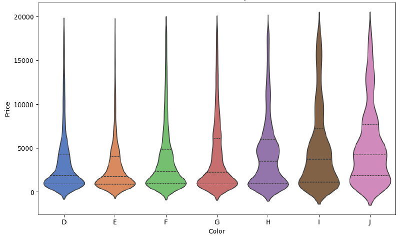
A violin plot visualizes both the distribution shape and summary statistics of data. It builds on the box plot but adds a smooth density shape, usually based on kernel density estimation. The result often resembles a violin, giving the chart its name.
Purpose
The purpose is to show not only median and spread, but also the shape of the distribution: modes, skewness, and density.
How to Read It
The width of the violin indicates density. Wider areas contain more observations. Internal marks may show the median, quartiles, or individual data points depending on the design.
Use Cases
- Comparing distributions across categories
- Showing multimodal data
- Supplementing or replacing box plots
- Exploratory data analysis
Design Notes
- Explain whether the plot shows KDE, raw points, or both.
- Be careful with small sample sizes.
- Use consistent bandwidth settings across groups.
- Consider box plots when summary statistics are enough.
Summary
Violin plots are useful when distribution shape matters. They reveal more than box plots, but their density estimates require careful interpretation.