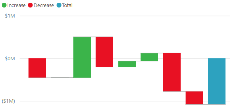
A waterfall chart visualizes incremental increases and decreases from an initial value to a final value. It separates positive, negative, and total components so readers can understand what caused the overall change.
The name comes from the way bars appear to step up and down like a waterfall.
Purpose
Waterfall charts are especially common in finance, where they explain how revenue, costs, adjustments, and other components lead to profit or loss.
How to Read It
Start with the initial value, then follow each bar in sequence. Upward bars add to the total, downward bars subtract from it, and the final bar shows the resulting value.
Design Notes
- Use color to distinguish increases, decreases, and totals.
- Keep the sequence logical.
- Label major components directly.
- Avoid too many small steps.
Summary
Waterfall charts are useful for explaining change as a sequence of contributions. They make bridge analysis easier to understand than a single before-and-after comparison.